All courses
Agentic AI
Agentic AI

IIIT Bangalore
Executive Programme in Generative AI for LeadersArtificial Intelligence
Degree / Exec. PG

IIIT Bangalore
Executive Diploma in Machine Learning and AI
OPJ Global University
Master’s Degree in Artificial Intelligence and Data Science
Liverpool John Moores University
Master of Science in Machine Learning & AI
Golden Gate University
DBA in Emerging Technologies with Concentration in Generative AIExecutive Certificate

IIITB & IIM, Udaipur
Chief Technology Officer & AI Leadership ProgrammeIIIT Bangalore
Executive Programme in Generative AI for Leaders
upGrad | Microsoft
Gen AI Foundations Certificate Program from MicrosoftupGrad | Microsoft
Gen AI Mastery Certificate for Data AnalysisupGrad | Microsoft
Gen AI Mastery Certificate for Software DevelopmentupGrad | Microsoft
Gen AI Mastery Certificate for Managerial ExcellenceOffline Bootcamps

upGrad
Data Science and AI-MLDoctorate
For All Domains
IIITB & IIM, Udaipur
Chief Technology Officer & AI Leadership Programme
Swiss School of Business and Management
Global Doctor of Business Administration from SSBM
Edgewood University
Doctorate in Business Administration by Edgewood UniversityGolden Gate University
Doctor of Business Administration From Golden Gate University
Rushford Business School
Doctor of Business Administration from Rushford Business School, SwitzerlandGolden Gate University
Master + Doctor of Business Administration (MBA+DBA)-d9bdeff6165f4eb1ba2adcebde78e961.svg)
University of Waterloo
Chief Technology and AI Officer ProgramLeadership / AI
Golden Gate University
DBA in Emerging Technologies with Concentration in Generative AIMachine Learning
Machine Learning
Data Science
Degree / Exec. PG
O.P Jindal Global University
Master’s Degree in Artificial Intelligence and Data ScienceIIIT Bangalore
Executive Diploma in Data Science & AILiverpool John Moores University
Master of Science in Data ScienceExecutive Certificate
upGrad | Microsoft
Gen AI Foundations Certificate Program from MicrosoftupGrad | Microsoft
Gen AI Mastery Certificate for Data AnalysisupGrad | Microsoft
Gen AI Mastery Certificate for Software DevelopmentupGrad | Microsoft
Gen AI Mastery Certificate for Managerial ExcellenceupGrad | Microsoft
Gen AI Mastery Certificate for Content CreationOffline Bootcamps
upGrad
Data Science and AI-MLupGrad
Data AnalyticsMBA
Masters

Paris School of Business
Master of Science in Business Management and TechnologyO.P.Jindal Global University
MBA (with Career Acceleration Program by upGrad)Edgewood University
MBA from Edgewood UniversityO.P.Jindal Global University
MBA from O.P.Jindal Global UniversityGolden Gate University
Master + Doctor of Business Administration (MBA+DBA)Executive Certificate

IMT, Ghaziabad
Advanced General Management ProgramMarketing
Executive Certificate
Offline Bootcamps
upGrad
Digital MarketingManagement
Degree
O.P Jindal Global University
MSc in International Accounting & Finance (ACCA integrated)Paris School of Business
Master of Science in Business Management and Technology
Golden Gate University
Master of Arts in Industrial-Organizational PsychologyExecutive Certificate

IIIT-B & IIM, Udaipur
Chief Technology Officer & AI Leadership Programme
IIM Kozhikode
Human Resource Analytics Course from IIM-KupGrad | Microsoft
Gen AI Foundations Certificate Program from MicrosoftEducation
Education

Northeastern University
Master of Education (M.Ed.) from Northeastern UniversityEdgewood University
Doctor of Education (Ed.D.)Edgewood University
Master of Education (M.Ed.) from Edgewood UniversityCertifications
Project Management
Certification

Knowledgehut
Leadership And Communications In ProjectsKnowledgehut
Microsoft Project 2007/2010-ae8d039bbd2a41318308f8d26b52ac8f.svg)
Knowledgehut
Financial Management For Project ManagersKnowledgehut
Fundamentals of Earned Value Management (EVM)Knowledgehut
Fundamentals of Portfolio ManagementKnowledgehut
Fundamentals of Program Management-35c169da468a4cc481c6a8505a74826d.webp&w=128&q=75)
Knowledgehut
CAPM® CertificationsKnowledgehut
Microsoft® Project 2016Certifications & Trainings
-7f4b4f34e09d42bfa73b58f4a230cffa.webp&w=128&q=75)
Knowledgehut
PMP® CertificationKnowledgehut
PMI-RMP® CertificationKnowledgehut
PMP Renewal Learning PathKnowledgehut
Oracle Primavera P6 V18.8Knowledgehut
Microsoft® Project 2013Knowledgehut
PfMP® Certification CourseKnowledgehut
Project Planning and MonitoringPrince2 Certifications

Knowledgehut
PRINCE2® FoundationKnowledgehut
PRINCE2® PractitionerKnowledgehut
PRINCE2 Agile Foundation and PractitionerKnowledgehut
PRINCE2 Agile® Foundation CertificationKnowledgehut
PRINCE2 Agile® Practitioner CertificationManagement Certifications
Knowledgehut
Project Management Masters Certification ProgramKnowledgehut
Change ManagementKnowledgehut
Project Management TechniquesKnowledgehut
Product Management Certification ProgramKnowledgehut
Project Risk Management- Study abroad
- Offline centres
- uGSOT - B.Tech
More


27. Columns in Excel
33. Count In Excel
49. Slicers in Excel
54. Solver in Excel
56. Macros In Excel
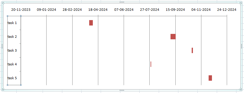
Gantt Chart in Excel
Excel remains my favored tool for data calculation and visual representation even after being in project management for so long. Working with large datasets can be overwhelming. Excel has made my life simpler. Using the available tools I can create tables and charts.
I use a Gantt chart in Excel to present the tasks of a project. It is a type of bar graph that helps simplify complicated tasks. These charts are mainly used in project management to visualize the duration of events.
Let me walk you through the steps of how to create an effective Excel project Gantt chart.
What is a Gantt Chart in Excel?
Gantt charts are project management tools. They are primarily used to visualize the duration of tasks or events. This useful tool has helped me look at my project timeline at a glance. Excel project Gantt chart organizes tasks with their starting and ending dates. The duration of different tasks is shown on the chart as bars.
Gantt chart in Excel has two main axes. The horizontal axis represents the project timeline, and the vertical axis lists the tasks. It has horizontal bars, with the length of the bar representing the duration. This has helped me immensely by letting me predict the timeline for my projects.
Let me show you an example of a Gantt chart Excel template.

Source: Microsoft Excel
A typical Gantt chart in Excel looks something like this. Let me go over the steps to make a Gantt chart in detail for you.
Steps to Make a Gantt Chart in Excel
Creating a Gantt chart in Excel requires using stacked bars. Working with the software for so long has taught me some tips and tricks. This is how I create Gantt chart Excel from my project data easily.
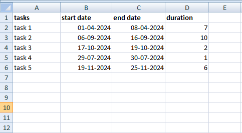
1. Create a table in Excel
I start by creating my project data in a spreadsheet. I list all the different tasks in different rows and their tenure. Make sure you mention the starting date, the ending date, and the duration of the project in this chart.
Source: Microsoft Excel
2. Create an Excel bar chart
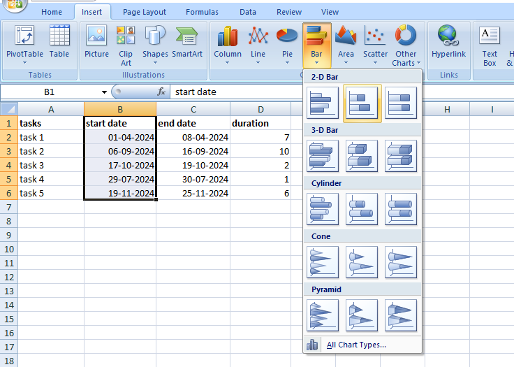
Unfortunately, Excel does not have any particular option for making Gantt charts. I use stacked bars to create the chart I want. These are the steps I follow:
Step 1: Select the starting date column along with the header. In my case, the range is from B1 to B6.
Step 2: Click on ‘Insert’ from the top ribbon.
Step 3: Navigate to the ‘Charts’ group
Step 4: Choose the ‘Bar’ option.
Step 5: From the ‘2D’ section, select the ‘Stacked Bar’ option.
Source: Microsoft Excel
When you choose this option, a Stacked Bar will appear on your screen:
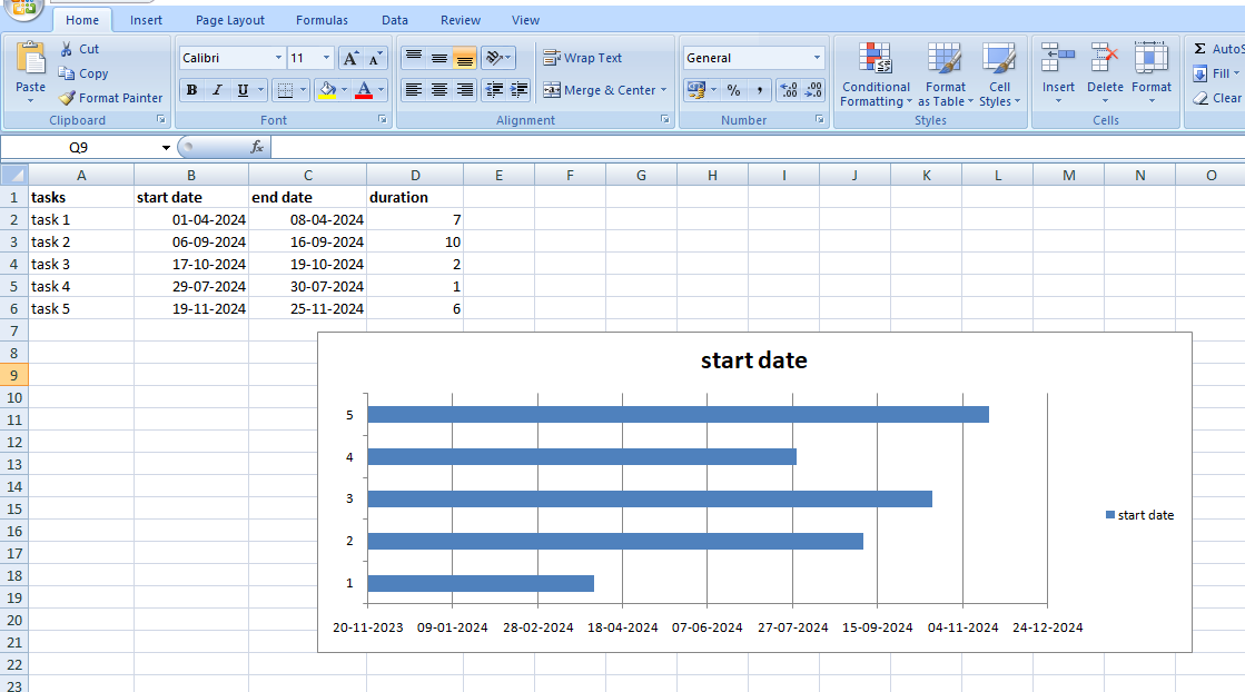
Source: Microsoft Excel
Note: Sometimes you might face the issue that all the dates at the bottom might overlap and not appear properly. You can simply use the cursor to drag and adjust the chart size.
3. Add duration to the stacked chart
To make the chart more elaborate, add the duration column to the chart. Check out the steps below:
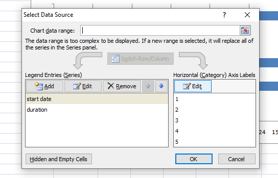
Step 1: Right-click on the top of the chart. You will be shown a menu. From the menu, choose the ‘Select Data’ option.
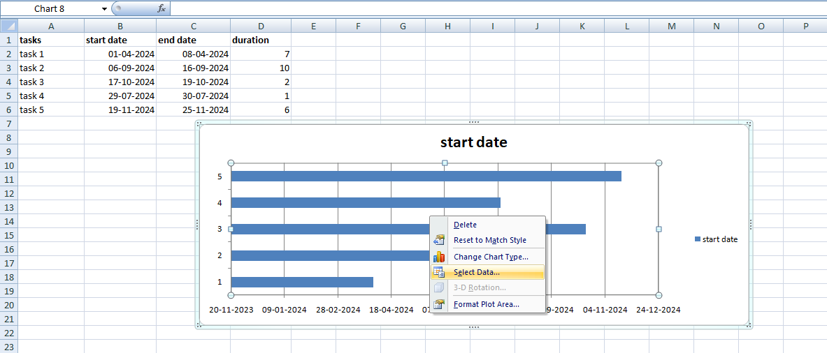
Source: Microsoft Excel
Once you select that option, the ‘Select Data Source’ dialogue box will appear on the screen.
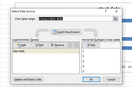
Source: Microsoft Excel
Look at the image above; start date has already been listed in ‘Legend Entries (Series)’. We want to add the duration to this series.
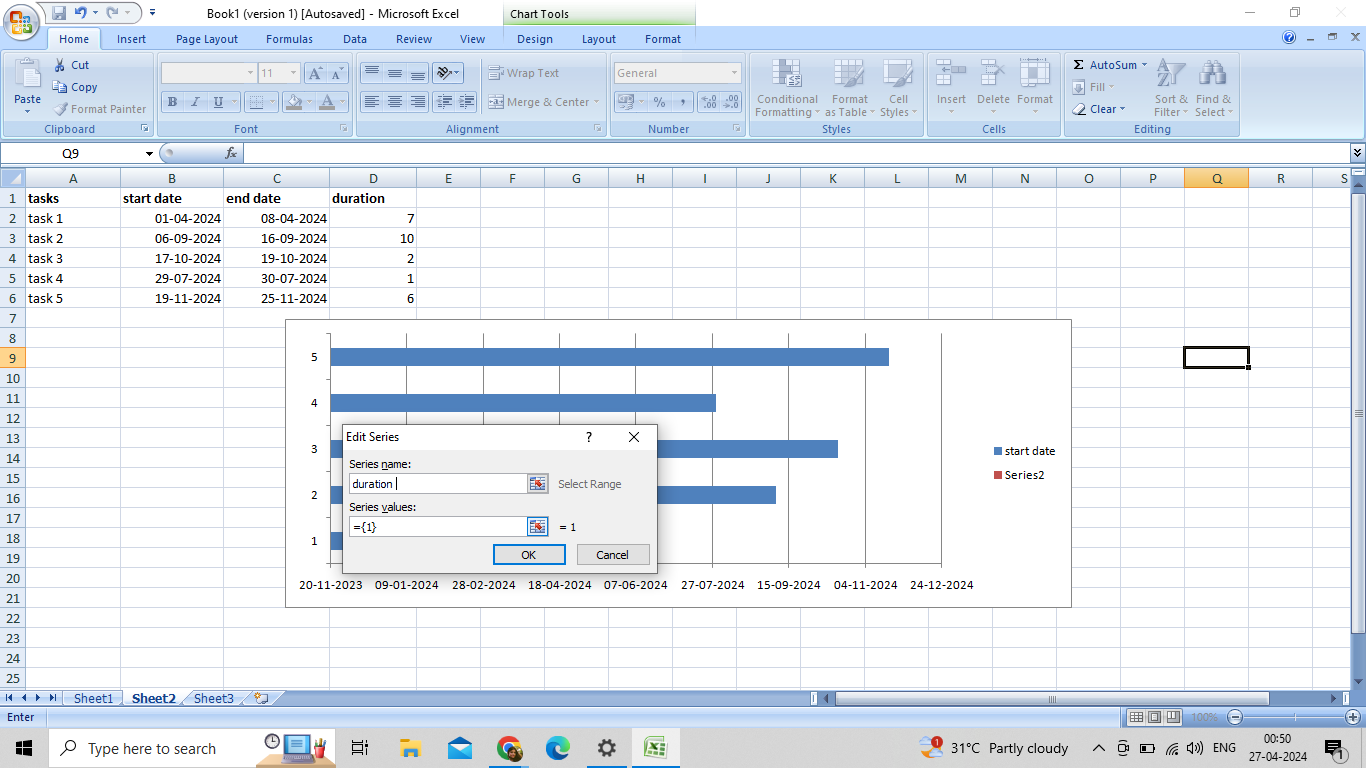
Step 2: Select the ‘Add’ button to include the duration data in the chart. The ‘Edit Series’ window will appear. Now enter the ‘Series name’ to whatever you want it to be. I have used ‘duration’, but you can choose anything you like.
Source: Microsoft Excel
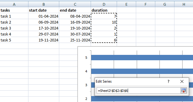
Step 3: Click on the blue icon beside the ‘series values’ bar to select the range. A ‘Edit Series’ option will appear on your screen. Using the cursor, select the range from the duration column. Do not add the header to this range
Source: Microsoft Excel
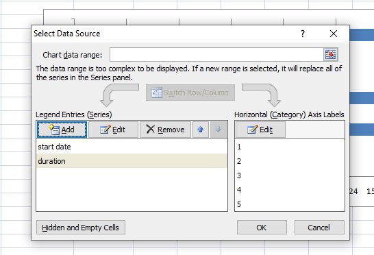
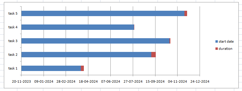
Step 4: Now, when I go back and press ‘OK’, I will again be shown the ‘Select Data Source’ window. In the image given below, you can see that ‘duration’ has been added to ‘Legend Entries (Series)’.
Source: Microsoft Excel
The resulting chart will look somewhat like this:
Source: Microsoft Excel
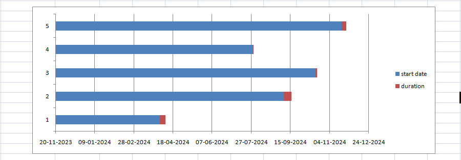
4. Add the task descriptions
You will notice that on the left of the chart, no task names have been mentioned. They are only represented by numbers. Here is how we can add the task names to the chart.
Step 1: Right-click on the chart. Select the ‘Select Data’ option from the menu. This will display the ‘Select Data Source’ window on your screen again.
Step 2: Select the ‘Edit’ option under the ‘Horizontal (Category) Axis Labels’ on the chart right. Keep an eye on the ‘start date’ is highlighted on the left panel.
Source: Microsoft Excel
Step 3: An ‘Axis Label’ window pops up on the screen. I selected the tasks just like I selected the ‘duration’.
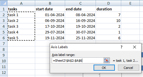
Source: Microsoft Excel
In my case, I placed my cursor at A2 and dragged it up to A6. Again, ensure that you are not including the header or any empty cell when selecting the column.
Step 4: Click on ‘OK’ twice, and the tasks will be added to the chart.
Source: Microsoft Excel
You can also remove the index provided on the right-hand side of the chart. Place the cursor over it and right click. A menu will appear from which you can select the ‘delete’ option.
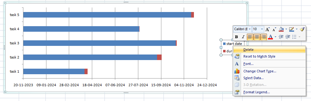
Source: Microsoft Excel
This is what my chart looks like without the index:
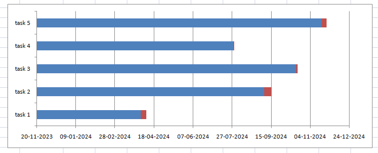
Source: Microsoft Excel
5. Transform the stacked bar to form a Gantt chart
The image given above is not a Gantt chart yet. To create a proper Gantt chart, I perform some formatting. I want to remove all the blue parts and only display the orange sections to make the tasks visible.
However, to achieve this, I will not remove the blue-colored bars but make them invisible. Let’s see how to do it to Gantt chart in Excel.
Step 1: Start by clicking on the blue bar. All the blue bars will be highlighted.
Step 2: Right-click and a menu will appear on your screen.
Step 3: Select the ‘Format Data Series’ option.
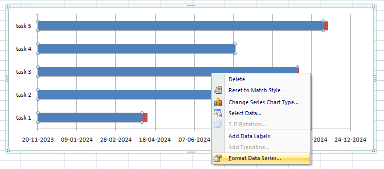
Source: Microsoft Excel
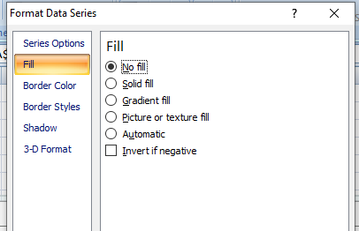
Step 4: From the ‘From Data Series’ window on your screen, navigate to the ‘Fill’ tab and choose ‘No Fill’.
Source: Microsoft Excel
Then, navigate to the ‘Border color’ tab and select the ‘No line’ option.
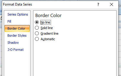
Source: Microsoft Excel
Finally, this is what the chart will look like.
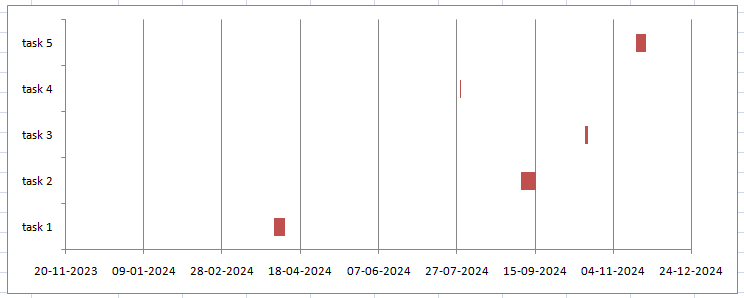
Source: Microsoft Excel
This helps easily identify the Gantt chart Excel milestones.
6. Fixing the order
As you can see, the tasks listed on my chart are in the reverse order. Let me show you how you can fix that.
Here, I have listed the steps to reverse the order of tasks.
Step 1: Right-click on the vertical axis over the listed tasks. A menu will appear as shown below.
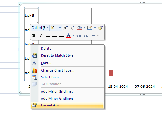
Source: Microsoft Excel
Step 2: Select the ‘Format Axis’ option. The ‘Format Axis’ window will appear on the screen.
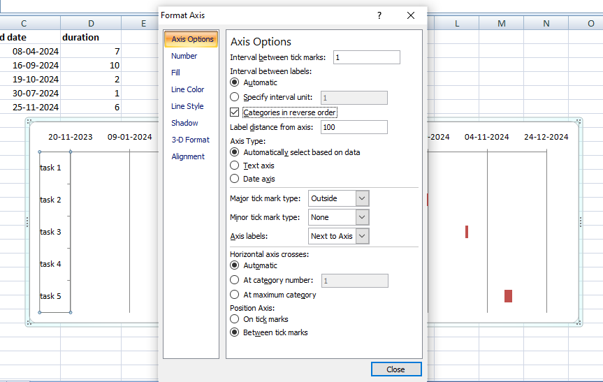
Source: Microsoft Excel
Step 3: Check the ‘Categories in reverse order’ check box and close the window.
Source: Microsoft Excel
Do you want to improve your Excel skills? Learn how you can boost your knowledge of Excel.
Benefits of employing a Gantt chart in Excel
Gantt chart in Excel is a popular tool among Project Managers. I have been using it to make my life simpler. Here are some of the benefits:
1. Visualizing project progression
A Gantt chart in Excel makes it simpler to see when projects begin and how they progress. This tool has helped me immensely in identifying overlapping projects.
It has also helped in identifying potential bottlenecks and making necessary changes. In these situations, staggering the dates slightly helps avoid possible issues.
2. Better time management
Let me illustrate this with an incident. Once, I had allotted three tasks to the same team with the same starting date. Using a Gantt chart in Excel helped me identify my mistakes and immediately make changes.
Understanding the tasks allocated to each team every day helps with better time management and equal task allocation.
3. Excel is easy
To manually create Gantt charts, Excel is daily easy-to-use software. As I have shown above, I simply add the data range to a spreadsheet and use the stacked bars option to create the Gantt charts.
Excel is very easy to use. However, knowing some Excel shortcuts can make the job even easier.
Final words
Gantt charts can be a blessing for Project Managers. It is an excellent project management tool used for project timeline tracking. Using a Gantt chart in Excel can help visualize project operations at a glance and streamline them.
Eager to learn more about Gantt chart in Excel with dates to streamline projects? Check out the certified courses offered by upGrad, which will help you boost your employability.
Frequently Asked Questions
1. How do you make a Gantt chart on Excel?
A Gantt chart in Excel is created using stacked bars. To get a full Excel Gantt chart tutorial, check out the steps listed above. What is Gantt chart formula?
2. What is Gantt chart formula?
Duration in Gantt charts can be calculated using the following formulae: Ending date - starting date = durationEnding date + starting date - 1 = duration Ending date - starting date = duration Ending date + starting date - 1 = duration What is a Gantt chart?
3. What is a Gantt chart?
A Gantt chart is a project management tool that comprises horizontal lines representing the time duration of a project. It makes visualizing project timelines easier. Where is Gantt chart view in Excel?
4. Where is Gantt chart view in Excel?
To create Gantt charts, you can use stacked bars. Navigate to the ‘Insert’ option from the top ribbon. From ‘Bars’ select ‘Stacked Bar’ listed under 2D options. How can I create a Gantt chart?
5. How can I create a Gantt chart?
You can create a simple Gantt chart Excel using the stacked bar option. Check out the steps of the process in this tutorial. You can create a simple Gantt chart Excel using the stacked bar option. Check out the steps of the process in this tutorial. How to make a simple Gantt chart?
6. How to make a simple Gantt chart?
The ‘Stacked Bar’ option is the way to create a simple Gantt chart in Excel. Furthermore, you can make changes to it as needed. How to create chart in Excel?
7. How to create chart in Excel?
Select the ‘Insert’ tab on the top ribbon. You will see a list of charts that you can use to present your data. Can you automate a Gantt chart in Excel?
8. Can you automate a Gantt chart in Excel?
You can make a Gantt chart in Excel and partly automate it. Although Excel doesn't come with a built-in Gantt chart tool, you can still use its features, such as conditional formatting, formulae, and bar charts, to put together a Gantt chart.

Author|15 articles published


upGrad Learner Support
Talk to our experts. We are available 7 days a week, 10 AM to 7 PM
Indian Nationals
Foreign Nationals
Disclaimer
The above statistics depend on various factors and individual results may vary. Past performance is no guarantee of future results.
The student assumes full responsibility for all expenses associated with visas, travel, & related costs. upGrad does not .