For working professionals
For fresh graduates
- Study abroad
More
- Post Graduate Certificate in Data Science & AI (Executive)
- Gen AI Foundations Certificate Program from Microsoft
- Gen AI Mastery Certificate for Data Analysis
- Gen AI Mastery Certificate for Software Development
- Gen AI Mastery Certificate for Managerial Excellence
- Gen AI Mastery Certificate for Content Creation
- Post Graduate Certificate in Product Management from Duke CE
- Human Resource Analytics Course from IIM-K
- Global Master Certificate in Integrated Supply Chain Management
- Gen AI Foundations Certificate Program from Microsoft
- CSM® Certification Training
- CSPO® Certification Training
- PMP® Certification Training
- SAFe® 6.0 Product Owner Product Manager (POPM) Certification
- Post Graduate Certificate in Product Management from Duke CE
- Professional Certificate Program in Cloud Computing and DevOps
- Python Programming Course
- Executive Post Graduate Programme in Software Dev. - Full Stack
- AWS Solutions Architect Training
- AWS Cloud Practitioner Essentials
- AWS Technical Essentials
- The U & AI GenAI Certificate Program from Microsoft
27. Columns in Excel
33. Count In Excel
49. Slicers in Excel
54. Solver in Excel
56. Macros In Excel
How To Create Dashboard in Excel
Analyzing progress reports from large volumes of raw datasets can be overwhelming. However, there is one great alternative: Excel Dashboard. Earlier, I usually dealt with data via Excel worksheets. When I transitioned to Excel Dashboard, it was a whole new experience.
In a nutshell, Excel Dashboard is a visual presentation of Key Point Indicators (KPIs), Key business metrics, and other complex data in an easy-to-understand format.
With a dashboard in Excel, you can showcase the most important information to your organization. All you need is the base version of Microsoft Excel. Once you finish creating your dashboard, as new data comes in, it will automatically update to reflect the latest data which you can easily share with your company.
If you are planning to pursue business analysis as a profession, remember that Excel skills are essential. Having made a career out of this myself, I canoot assert more on how much of a handy tool it is. I extensively use it to analyze major company aspects and hierarchy of profit, unit sales, and other business-related factors. If you want to use it as well, I’ve shared all that I know in this guide.
How To Create Dashboard in Excel
First things first, you need to make your pivot table once you acquire raw data. Ensure that no rows or columns are left empty because it would result in data corruption.
Now, let’s move on to making the dashboard. First, you have to consider the hierarchical growth of your data. You are supposed to display the major aspects of your comparative analysis by using pivot charts. Here are some Excel dashboard examples.
To create your own Excel dashboard templates, follow the procedure given below.
- Firstly, just click your raw data, then go to ‘Insert’ and select ‘Pivot table.’ Insert them in a new sheet where the pivot table field list tab is present.

Source - MS Excel


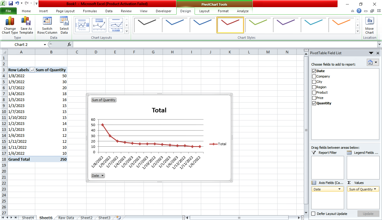
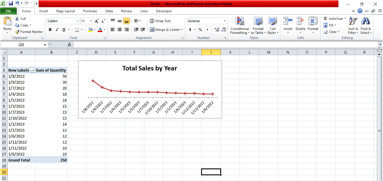
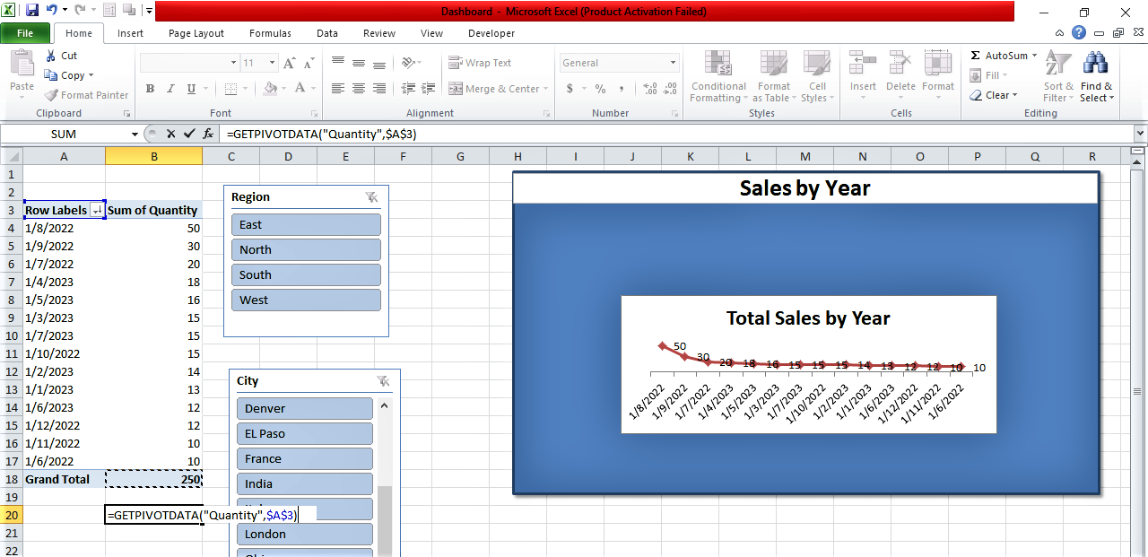
- Let's call this new sheet ‘New Total Sales’. Select the date for the row labels section and the quantity of products for the values section. Then, sort the data from largest to smallest.

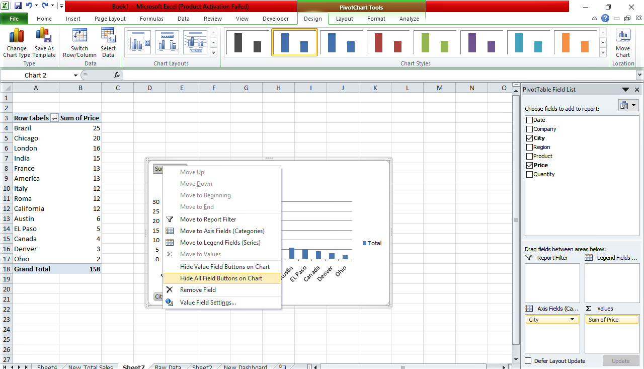
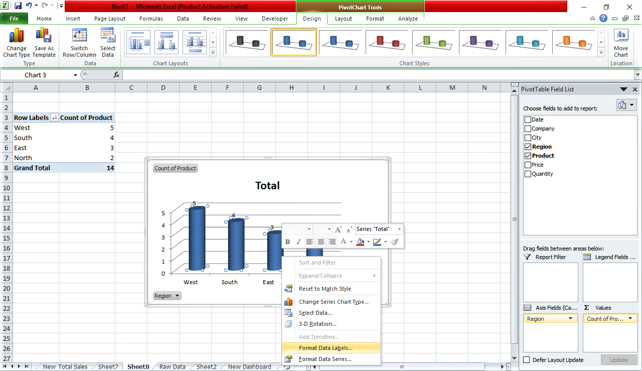
- Now click on the data and select a suitable pivot chart. And proceed with some basic formatting. You can remove all the names by right-clicking on the names and selecting hide all field buttons on Chart. You can also select an appropriate chart size. Finally, rename your chart.
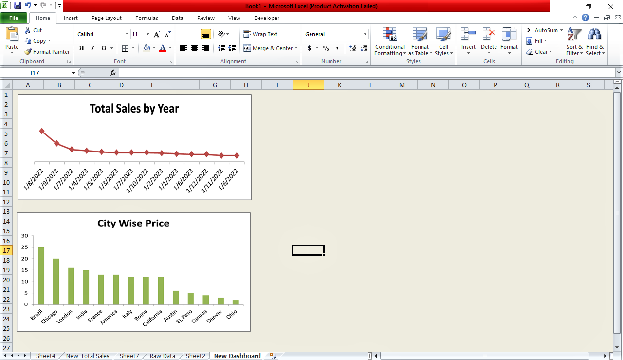
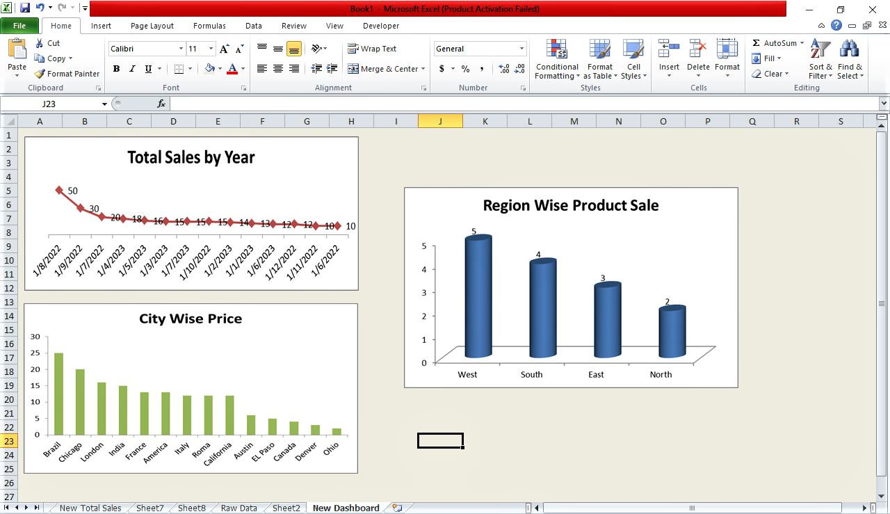
- Now create a new sheet, which will be called ‘New Dashboard’, and then copy and paste your chart on your Excel dashboard. You may choose any base color for your dashboard background by selecting the whole sheet.

- You can create further pivot charts from new pivot tables, add them and align them as needed by following the same method in the Excel dashboard.

- Now, in order to show the fluctuations of your data with clarity, you need to format the data labels by right-clicking on the chart. Hence, you can display the numerical data anywhere in the chart.
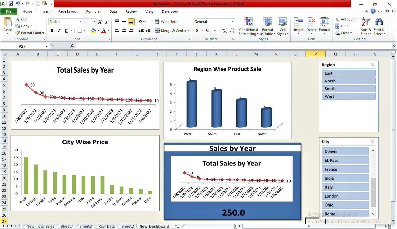
- Now, you need to insert a slicer. A slicer is a visual tool provided by MS Excel for pivot tables that allows you to filter your data based on visual cues.
- To insert a slicer, click on it from the pivot chart tools bar. In this case, you can insert your slicer based on region.

- You can add as many slicers as you want. I'm using another slicer for the city here.
- Now, I need to connect all these charts to these slicers. Just right-click, select report connection, and select all the pivot tables that you have just made. Click the ‘OK’ button.
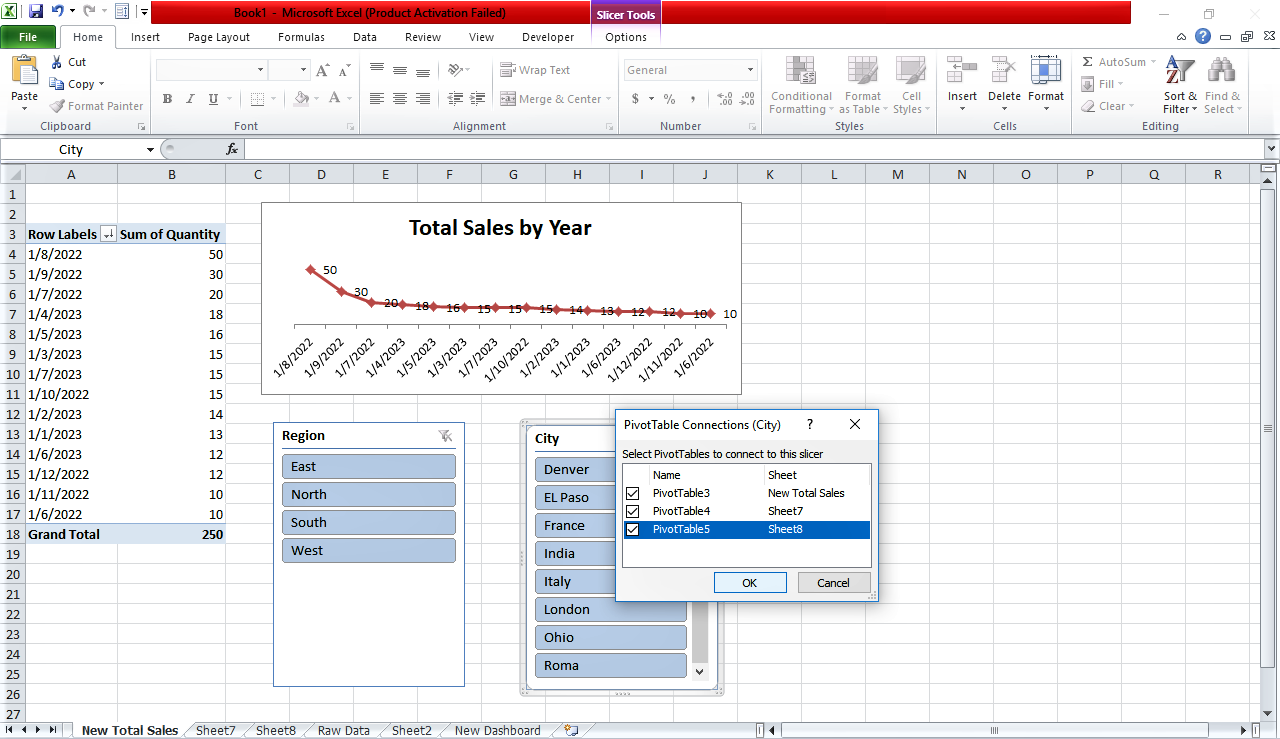
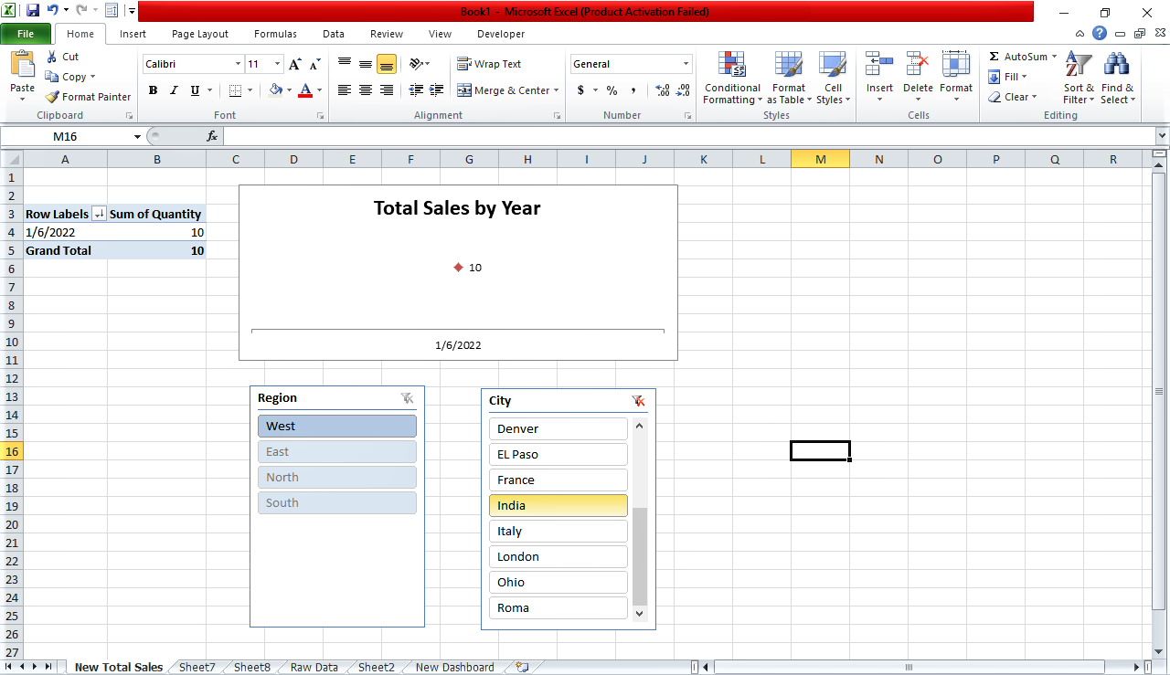
- And now this is totally linked. If you do a selection in slicers, the respective charts will change accordingly.
- Now, let's look at the final Excel dashboard template.
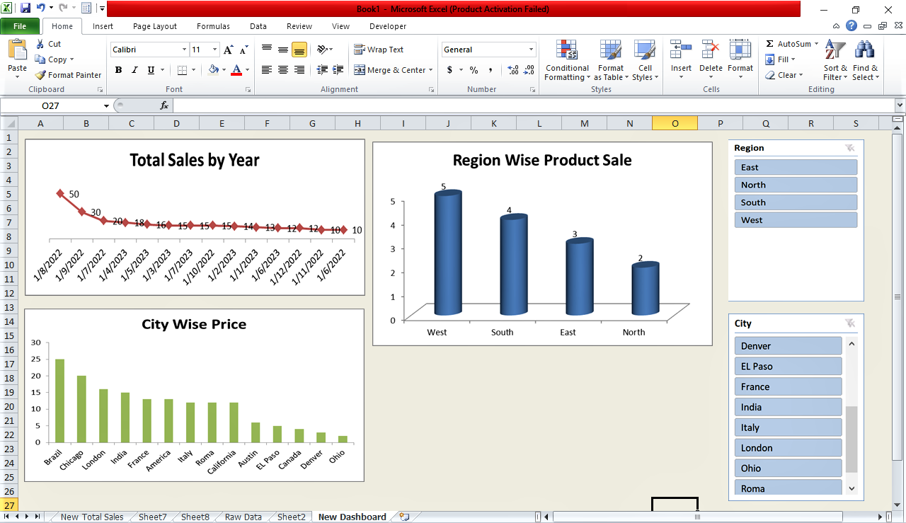
Why an Interactive Dashboard Excel ?
An Interactive dashboard (Excel), also known as a dynamic dashboard in Excel allows you to interact with your data by displaying, analyzing, tracking and monitoring key business metrics.
Where a static dashboard provides a fixed view of your data, you can engage deeper into your organization’s operational information and can filter it in several different ways using an interactive dashboard (Excel).
What is the KPI Dashboard in Excel?
KPIs (key performance indicators) are basically individual metrics which can be displayed on an Excel dashboard to keep track of the key measurements. Excel Dashboards are a collection of insights and KPIs put together on a page.
As I have already shown above, a KPI dashboard in Excel displays key performance indicators in interactive charts and graphs to allow for quick and organized review and analysis.
Create a Dashboard Card in Excel
Here’s how you can create a dashboard card in Excel:
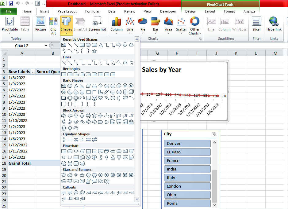
- Select the pivot chart
- Go to insert
- Go to illustrations
- Click on shapes,
- Select rectangle.
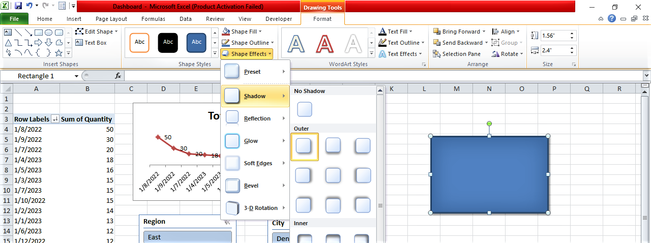
- Click on the format tab
- Click on shape effects. You can apply shadow here.
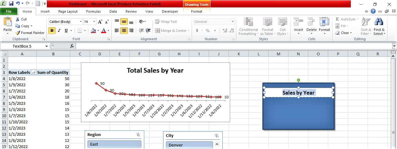
- Then, add a title to this shape. Go to insert, select text, click on the text box, and type the title for this visual. You can change the alignment, color, and font size of the title.
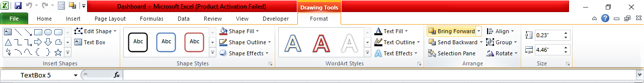
- Select your chart and drag it over the card, go to format, and click on bring forward.
- Now assign a value to this card. To do so, go to any blank cell, type equal to refer to the grand total of the values from the pivot table, and hit enter.
- Now select this cell, go to format, and assign some thousand separators and decimal places. Select the card, go to the formula bar, type equal to, and refer to the grand total value. Keeping the card selected, do the necessary alignment to make the value visible on the card.
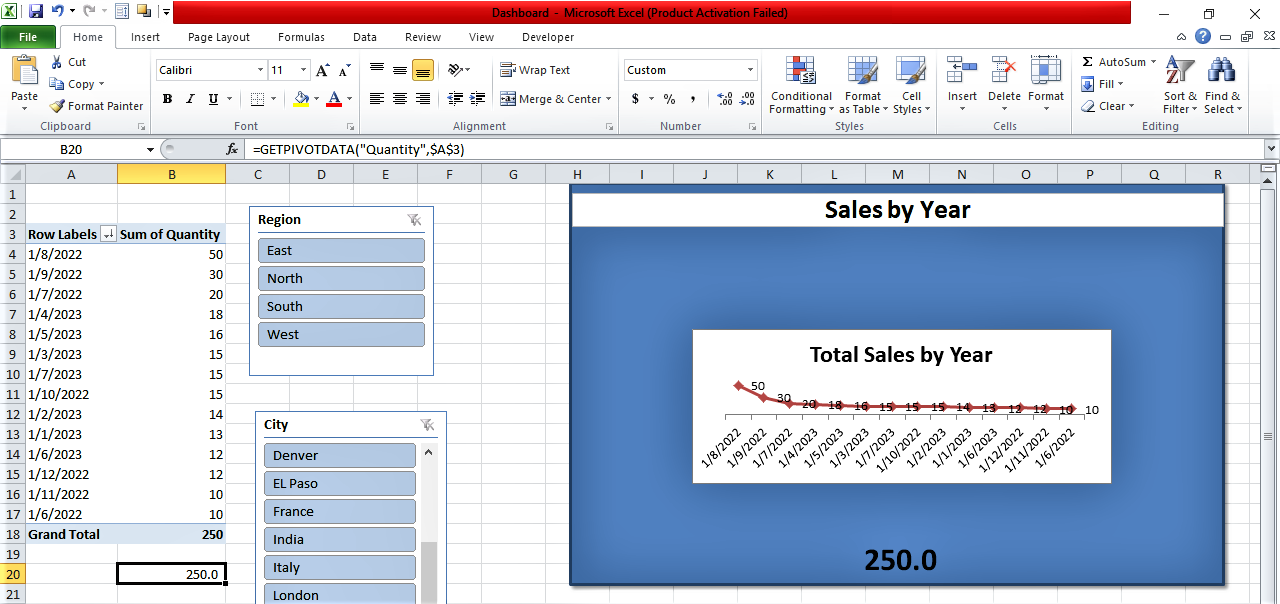
- Now if you apply filters on the slicer the chart will change, the pivot table and grand total value will also change hence the card will show changes accordingly.

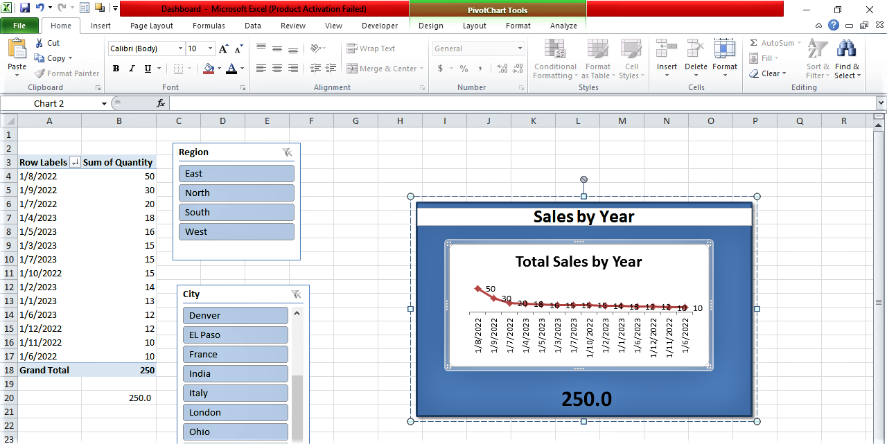
- Next, you need to group the elements in the card. Select the card title and CTRL key, select chart, right-click on this and go to group. This will group this card in one group, so you can easily move it to your Excel dashboard.

Wrapping Up
An Excel dashboard not only helps data visualization in Excel but also performs efficiently in managing that data. I hope this Excel Dashboard tutorial has equipped you with the knowledge you need. Learning about these Excel features is a great way to brush up on your and improve your Excel skills.
Moreover, if you are looking to advance your career further, take a look at the professional certificate program in data science and business analytics that upGrad offers. Affiliated to prestigious universities and with curricula curated by industry experts, these courses will not only give you the added expertise but also a better chance at a better job position.
Frequently Asked Questions
- How do I create a dashboard in Excel?
An Excel dashboard can be created following some key steps that I have explained above.
- What is an Excel dashboard used for?
An Excel dashboard is mainly used for visualizing and monitoring data for business purposes.
- Is Excel dashboard free?
Yes, you can create and use your Excel dashboard for absolutely free. You just need a basic version of MS Excel.
- How do I create a dashboard card in Excel?
To create a dashboard card in Excel, follow the steps I have explained above.
- What is a KPI dashboard?
A KPI Dashboard in Excel is used to display key performance indicators in interactive charts and graphs.
- What is VLOOKUP in Excel?
VLOOKUP, or Vertical Lookup, is a very useful function that makes Excel search for a certain value in a column and return a value from a different column in the same row.
- Can you have a dashboard in Excel?
Surely, you can create a dashboard in Excel to display the hierarchical changes in your data.
- How to pivot table in Excel?
You just need to select a cell of your raw data, go to the insert tab, and select the pivot table. Thus, a pivot table will be created for those raw data.
- What is Excel interactive dashboard?
An interactive dashboard excel allows you to interact with your data by displaying, analyzing and monitoring key business metrics.

Author


upGrad Learner Support
Talk to our experts. We are available 7 days a week, 9 AM to 12 AM (midnight)
Indian Nationals
1800 210 2020
Foreign Nationals
+918068792934
Disclaimer
1.The above statistics depend on various factors and individual results may vary. Past performance is no guarantee of future results.
2.The student assumes full responsibility for all expenses associated with visas, travel, & related costs. upGrad does not provide any a.