All courses
Agentic AI
Agentic AI

IIIT Bangalore
Executive Programme in Generative AI for LeadersArtificial Intelligence
Degree / Exec. PG

IIIT Bangalore
Executive Diploma in Machine Learning and AI
OPJ Global University
Master’s Degree in Artificial Intelligence and Data Science
Liverpool John Moores University
Master of Science in Machine Learning & AI
Golden Gate University
DBA in Emerging Technologies with Concentration in Generative AIExecutive Certificate

IIITB & IIM, Udaipur
Chief Technology Officer & AI Leadership ProgrammeIIIT Bangalore
Executive Programme in Generative AI for Leaders
upGrad | Microsoft
Gen AI Foundations Certificate Program from MicrosoftupGrad | Microsoft
Gen AI Mastery Certificate for Data AnalysisupGrad | Microsoft
Gen AI Mastery Certificate for Software DevelopmentupGrad | Microsoft
Gen AI Mastery Certificate for Managerial ExcellenceOffline Bootcamps

upGrad
Data Science and AI-MLDoctorate
For All Domains
IIITB & IIM, Udaipur
Chief Technology Officer & AI Leadership Programme
Swiss School of Business and Management
Global Doctor of Business Administration from SSBM
Edgewood University
Doctorate in Business Administration by Edgewood UniversityGolden Gate University
Doctor of Business Administration From Golden Gate University
Rushford Business School
Doctor of Business Administration from Rushford Business School, SwitzerlandGolden Gate University
Master + Doctor of Business Administration (MBA+DBA)-d9bdeff6165f4eb1ba2adcebde78e961.svg)
University of Waterloo
Chief Technology and AI Officer ProgramLeadership / AI
Golden Gate University
DBA in Emerging Technologies with Concentration in Generative AIMachine Learning
Machine Learning
Data Science
Degree / Exec. PG
O.P Jindal Global University
Master’s Degree in Artificial Intelligence and Data ScienceIIIT Bangalore
Executive Diploma in Data Science & AILiverpool John Moores University
Master of Science in Data ScienceExecutive Certificate
upGrad | Microsoft
Gen AI Foundations Certificate Program from MicrosoftupGrad | Microsoft
Gen AI Mastery Certificate for Data AnalysisupGrad | Microsoft
Gen AI Mastery Certificate for Software DevelopmentupGrad | Microsoft
Gen AI Mastery Certificate for Managerial ExcellenceupGrad | Microsoft
Gen AI Mastery Certificate for Content CreationOffline Bootcamps
upGrad
Data Science and AI-MLupGrad
Data AnalyticsMBA
Masters

Paris School of Business
Master of Science in Business Management and TechnologyO.P.Jindal Global University
MBA (with Career Acceleration Program by upGrad)Edgewood University
MBA from Edgewood UniversityO.P.Jindal Global University
MBA from O.P.Jindal Global UniversityGolden Gate University
Master + Doctor of Business Administration (MBA+DBA)Executive Certificate

IMT, Ghaziabad
Advanced General Management ProgramMarketing
Executive Certificate
Offline Bootcamps
upGrad
Digital MarketingManagement
Degree
O.P Jindal Global University
MSc in International Accounting & Finance (ACCA integrated)Paris School of Business
Master of Science in Business Management and Technology
Golden Gate University
Master of Arts in Industrial-Organizational PsychologyExecutive Certificate

IIIT-B & IIM, Udaipur
Chief Technology Officer & AI Leadership Programme
IIM Kozhikode
Human Resource Analytics Course from IIM-KupGrad | Microsoft
Gen AI Foundations Certificate Program from MicrosoftEducation
Education

Northeastern University
Master of Education (M.Ed.) from Northeastern UniversityEdgewood University
Doctor of Education (Ed.D.)Edgewood University
Master of Education (M.Ed.) from Edgewood UniversityCertifications
Project Management
Certification

Knowledgehut
Leadership And Communications In ProjectsKnowledgehut
Microsoft Project 2007/2010-ae8d039bbd2a41318308f8d26b52ac8f.svg)
Knowledgehut
Financial Management For Project ManagersKnowledgehut
Fundamentals of Earned Value Management (EVM)Knowledgehut
Fundamentals of Portfolio ManagementKnowledgehut
Fundamentals of Program Management-35c169da468a4cc481c6a8505a74826d.webp&w=128&q=75)
Knowledgehut
CAPM® CertificationsKnowledgehut
Microsoft® Project 2016Certifications & Trainings
-7f4b4f34e09d42bfa73b58f4a230cffa.webp&w=128&q=75)
Knowledgehut
PMP® CertificationKnowledgehut
PMI-RMP® CertificationKnowledgehut
PMP Renewal Learning PathKnowledgehut
Oracle Primavera P6 V18.8Knowledgehut
Microsoft® Project 2013Knowledgehut
PfMP® Certification CourseKnowledgehut
Project Planning and MonitoringPrince2 Certifications

Knowledgehut
PRINCE2® FoundationKnowledgehut
PRINCE2® PractitionerKnowledgehut
PRINCE2 Agile Foundation and PractitionerKnowledgehut
PRINCE2 Agile® Foundation CertificationKnowledgehut
PRINCE2 Agile® Practitioner CertificationManagement Certifications
Knowledgehut
Project Management Masters Certification ProgramKnowledgehut
Change ManagementKnowledgehut
Project Management TechniquesKnowledgehut
Product Management Certification ProgramKnowledgehut
Project Risk Management- Study abroad
- Offline centres
- uGSOT - B.Tech
More


27. Columns in Excel
33. Count In Excel
49. Slicers in Excel
54. Solver in Excel
56. Macros In Excel
How To Make Graph in Excel
In school, curating graphs was a fun activity. Fast forward to a decade later, when I landed my first job, it seemed like a whole new world I wasn’t familiar with. It was rough at first. Excel's sea of data left me feeling lost.
But I set out to master Excel with beginner-friendly Excel tutorials, got tips from coworkers, and most importantly, practiced. Learning how to draw charts and graphs in Excel helped me make sense of all the data overload and turned it into something people could actually understand. They made me way more effective at my job and helped me stand out as someone who could really make data talk.
And, if I could learn how to make graph in Excel, so can you. I’ve curated this beginner-friendly tutorial to help you understand all you need to know about an Excel graph and most importantly, how to draw graph in Excel.
What is an Excel Graph?
Excel skills are a career must-have for data analysis, offering professionals the tools to handle data effectively, boosting job opportunities and advancement potential. Excel's graphing skills are also invaluable. An Excel graph is basically a drawing based on the data sets within an Excel sheet. You can decide which values to take and which to exclude and customize this graph.
Visual representations like an Excel graph are more impactful than a bunch of numbers on a screen. It helps to communicate findings effectively.
How to Plot Graphs in Excel: Step-By-Step
Learn how to make a graph in Excel by following the steps below:
- Insert Tab > Charts > Choose the chart of your choice
Source: MS Excel
To make the most of Excel's power, let's break down the key differences between charts and graphs in Excel.
Difference Between Charts and Graphs in Excel
I will be honest, the terms "chart" and "graph" are used interchangeably and for beginners, it can all feel a bit confusing. Let’s clear things up!
Bottom line: All graphs are charts, but not all charts are graphs.
Meaning?
Charts visually represent data broadly, including graphs, pie charts, and diagrams, simplifying complex data sets, while graphs specifically focus on plotting numerical data on the x and y axes to reveal mathematical relationships and trends, making it crucial to select the appropriate visualization tool based on the specific data analysis needs.
Stay tuned, because I'll dive into some specific ways to use these tools to make your Excel data tell compelling stories! And you will definitely know how to draw a graph in Excel.
Types of Excel Graph
Now you may be wondering “Which type of charts can Excel produce?” And which is the best chart for me? The best way to create a graph in Excel depends on what you want to plot. Let’s look at the table below:
Chart Types | Description | Best For |
Column Chart | It compares values across categories. Column chart makes easy comparisons over a span of time. | It is best for showcasing data changes and comparing values. |
Line Chart | It is used to compare trends over time or continuous data. | It is best for predicting trends and tracking short and long periods. |
Pie Chart | It is used to show the proportions or contributions of a whole group. | It is best for showcasing small breakdowns of a whole. |
Bar Chart | It is similar to column charts but used for long category names. | Best for comparing multiple items. |
Scatter Plot | It is used to show a correlation between two or more sets of numerical data. | It is best for understanding patterns and detecting them. |
Area Chart | It is like a Line chart only but the difference is under each line the area is filled with a color. | It is best for highlighting changes and emphasizing volume over time. |
Stock Chart | This chart is used for showcasing stock prices of low, high, and closing stocks. | This chart is best for highlighting the stock prices of various stocks. |
Bubble Chart | It is like a Scatter plot and showcases relationships between sets of numerical data. | Best for displaying relationships. |
Radar Chart | It is used to compare multiple variables in a web-like shape. | It is used for comparing quantitative variables. |
Treemap Chart | It also illustrates hierarchical data structures. | It is used for comparing the relative sizes of a large number of categories. |
Sunburst Chart | It is a multi-level pie chart and uses a radial structure. | It is best for visualizing hierarchical data. |
Histogram Chart | It is used to display numerical data in ranges. | It is good for understanding the range of the values in data. |
Box & Whisker Chart | It is made of two parts - a box and whiskers. The box part of the chart shows where your data points are concentrated and the whiskers show extreme values. | It is highly useful in comparing multiple datasets side by side. |
Surface Chart | It is a 3D chart. | It is mostly used for visualizing trends in landscapes. |
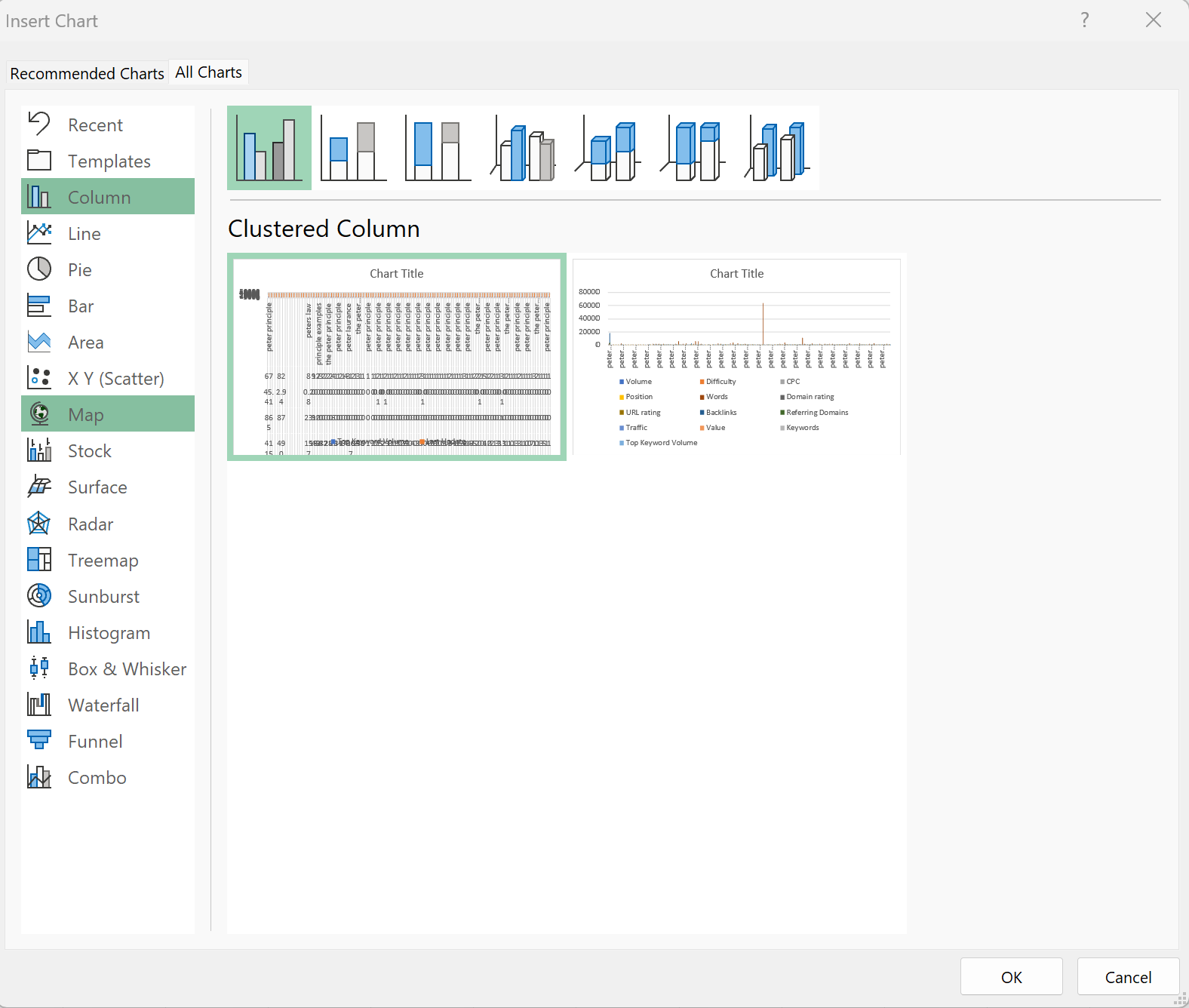
How to Create Chart in Excel
In this tutorial on how to make charts in Excel, let’s keep things simple and start with the top 5 most commonly used charts.
1. Column Chart
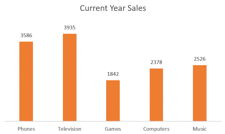
Source - goskills
How can you make a column chart in Excel?
Here’s how you can make a column chart:
- Organize your data: It should be in columns and rows.
- Select Data: Highlight the data that you need to put in the graph.
- Go to Insert > Charts > Column Charts
2. Line Chart
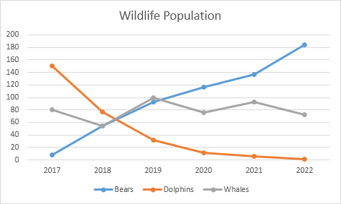
Source - Excel Easy
How can you make a Line Chart in Excel?
Looking to create a line chart? Here are the steps:
- Organize your data: Data should be arranged in a timely manner with corresponding values.
- Select/Highlight: Select your data.
- Go to Insert tab > Charts > Choose chart style
3. Pie Chart
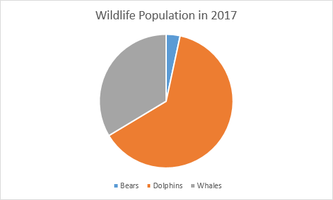
Source - Excel Easy
How can you make a Pie Chart in Excel?
Let’s make a pie chart using the steps below:
- Organize your data: Data should be arranged in columns one for labels and one for corresponding labels.
- Select/Highlight: Select your data.
- Go to Insert tab > Charts > Choose the desired Pie Chart icon
4. Bar Chart
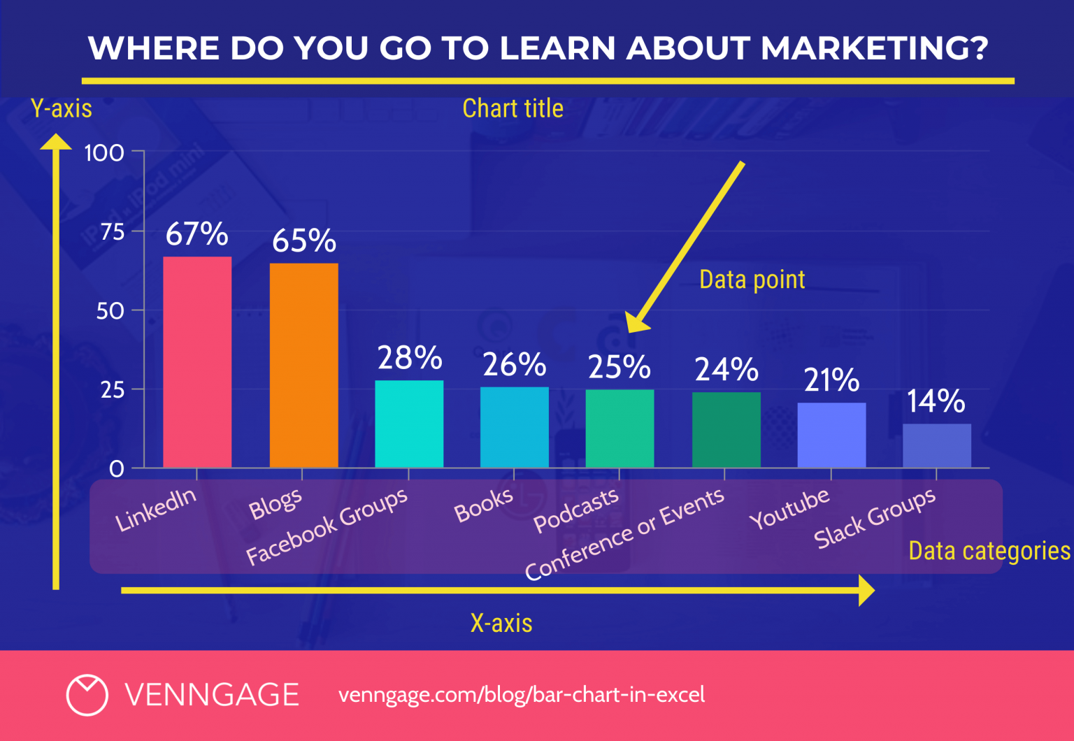
Source - Venngage
How to make Bar Chart in Excel?
To learn how to create bar chart in Excel, follow the simple steps below:
- Prepare your data: Like you do for a column chart, put your data with categories in one column and values in the next.
- Select data: Highlight the data.
- Go to Insert tab > Charts > Choose Bar Chart Icon
5. Scatter Chart
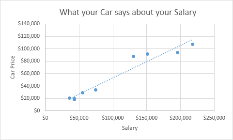
Source: Numerade
How can you make a Scatter Chart graph in Excel?
Here’s how to make a graph in the scatter chart format:
- Set your data: Lay out two columns related to numerical data.
- Select data: Highlight both the columns.
- Go to Insert tab > Charts > Choose Scatter Plot Icon
Tips and Tricks to How to Make Graph in Excel
Looking to learn how to plot graph in Excel? Here are some general charting tips including how to make a graph in Excel:
- Black and white patterns: Use grayscale pattern fills for monochrome printing or photocopying. This adds visual interest to your graphs while staying printer-friendly.
- Save a chart as a picture: Need your Excel graph for a presentation or website? Use the "Save As" > Web Page workaround to create a separate PNG image file.
- Adjust column overlap and spacing: For better visual balance in your graphs, right-click on a series > Format Data Series to modify overlap and gap width.
- Larger bars: If you're creating graphs with date-based data and find the bars too narrow, right-click the X-axis > Format Axis > Text Axis to increase bar width.
Advanced Charting Techniques to help learn how to make a graph in Excel
If you are an advanced learner looking for advanced tips on how to insert chart in Excel, here’s some advice you can choose to follow:
- Plotting on a second axis: When visualizing data with very different scales on your graph, assign a series to a secondary axis for clarity.
- Crezting combination charts: Mix and match graph types (ex: line and column) for a more informative display. Select a series -> Change Chart Type.
- Auto-growing Excel charts: If your graph's data will expand over time, format your data as a table for charts that update automatically.
- Smarter chart title: Want a chart title that changes as your data does? Link it directly to a worksheet cell.
- Variable colors for Excel charts: Add visual appeal to your graphs by right-clicking a series > Format Data Series > select "Vary colors by point".
In Conclusion
In the tutorial “How to Make Graph in Excel” I have covered the basics of how to prepare graphs in Excel. This brings us to one of the main functions of Excel; to provide better data organization and visualization. This makes graphs and charts integral to Excel.
If you are planning to go into the in-depth details of “how to make charts in Excel'' then why not consider turning it into a full-blown career? You can upskill yourself with the myriad of professional and relevant courses that upGrad offers. Designed and curated by industry experts, these courses are not only easy to understand but also offer the professional skills you need to shine in your career.
Frequently Asked Questions
1. How do you make an XY graph in Excel?
To create an XY graph, first select X and Y data columns, then go to Insert > Charts > Scatter Plot Graph. (Since Scatter plot graphs are the most common XY charts) How do I create a chart with multiple data in Excel?
2. How do I create a chart with multiple data in Excel?
Select all the data and labels you want to include then from the Insert tab > Charts. How do you write on a graph in Excel?
3. How do you write on a graph in Excel?
Here’s how to make graph in Excel that you can write on. You will have to insert a text box to write anything on a graph in Excel. (Insert > Text Box) How do I make a bar graph in Excel?
4. How do I make a bar graph in Excel?
To learn how to make bar graph in Excel, follow the steps here. First, you will need all your data in columns > Select the data > Go to Insert > Charts > Bar Chart. (Choose from the various styles of the Bar Graph) How to make a line graph?
5. How to make a line graph?
Line graphs are one of the first graphs you will come across while learning how to prepare graph in Excel. First, organize your data in periods and columns. Then go to Insert > Charts > Line Chart. What is the formula to graph line?
6. What is the formula to graph line?
y = mx + b where m = slope, b = y intercept. Is Excel good for making graphs?
7. Is Excel good for making graphs?
Yes, Excel is good for making graphs as one of Excel's core functions is data organization and visualization. Therefore, learning how to create graph in Excel will give you a career-changing skill. Why are charts useful in Excel?
8. Why are charts useful in Excel?
Charts help understand the data through visualization. It helps in understanding the trends and patterns of the raw numbers. Can you manually make a graph in Excel?
9. Can you manually make a graph in Excel?
Yes, one can manually plot graph in Excel with more complex plotting points.

Author|15 articles published


upGrad Learner Support
Talk to our experts. We are available 7 days a week, 10 AM to 7 PM
Indian Nationals
Foreign Nationals
Disclaimer
The above statistics depend on various factors and individual results may vary. Past performance is no guarantee of future results.
The student assumes full responsibility for all expenses associated with visas, travel, & related costs. upGrad does not .