All courses
Agentic AI
Agentic AI

IIIT Bangalore
Executive Programme in Generative AI for LeadersArtificial Intelligence
Degree / Exec. PG

IIIT Bangalore
Executive Diploma in Machine Learning and AI
OPJ Global University
Master’s Degree in Artificial Intelligence and Data Science
Liverpool John Moores University
Master of Science in Machine Learning & AI
Golden Gate University
DBA in Emerging Technologies with Concentration in Generative AIExecutive Certificate

IIITB & IIM, Udaipur
Chief Technology Officer & AI Leadership ProgrammeIIIT Bangalore
Executive Programme in Generative AI for Leaders
upGrad | Microsoft
Gen AI Mastery Certificate for Software DevelopmentupGrad | Microsoft
Gen AI Mastery Certificate for Managerial ExcellenceOffline Bootcamps

upGrad
Data Science and AI-MLDoctorate
For All Domains
IIITB & IIM, Udaipur
Chief Technology Officer & AI Leadership Programme
Swiss School of Business and Management
Global Doctor of Business Administration from SSBM
Edgewood University
Doctorate in Business Administration by Edgewood UniversityGolden Gate University
Doctor of Business Administration From Golden Gate University
Rushford Business School
Doctor of Business Administration from Rushford Business School, SwitzerlandGolden Gate University
Master + Doctor of Business Administration (MBA+DBA)-d9bdeff6165f4eb1ba2adcebde78e961.svg)
University of Waterloo
Chief Technology and AI Officer ProgramLeadership / AI
Golden Gate University
DBA in Emerging Technologies with Concentration in Generative AIMachine Learning
Machine Learning
Data Science
Degree / Exec. PG
O.P Jindal Global University
Master’s Degree in Artificial Intelligence and Data ScienceIIIT Bangalore
Executive Diploma in Data Science & AILiverpool John Moores University
Master of Science in Data ScienceExecutive Certificate
upGrad | Microsoft
Gen AI Foundations Certificate Program from MicrosoftupGrad | Microsoft
Gen AI Mastery Certificate for Data AnalysisupGrad | Microsoft
Gen AI Mastery Certificate for Software DevelopmentupGrad | Microsoft
Gen AI Mastery Certificate for Managerial ExcellenceupGrad | Microsoft
Gen AI Mastery Certificate for Content CreationOffline Bootcamps
upGrad
Data Science and AI-MLupGrad
Data AnalyticsMBA
Masters

Paris School of Business
Master of Science in Business Management and TechnologyO.P.Jindal Global University
MBA (with Career Acceleration Program by upGrad)Edgewood University
MBA from Edgewood UniversityO.P.Jindal Global University
MBA from O.P.Jindal Global UniversityGolden Gate University
Master + Doctor of Business Administration (MBA+DBA)Executive Certificate

IMT, Ghaziabad
Advanced General Management ProgramMarketing
Executive Certificate
Offline Bootcamps
upGrad
Digital MarketingManagement
Degree
O.P Jindal Global University
MSc in International Accounting & Finance (ACCA integrated)
Golden Gate University
Master of Arts in Industrial-Organizational PsychologyExecutive Certificate

IIIT-B & IIM, Udaipur
Chief Technology Officer & AI Leadership ProgrammeIIIT-B & IIM, Udaipur
Chief Data and AI Officer Programme
IIM Kozhikode
Human Resource Analytics Course from IIM-KupGrad | Microsoft
Gen AI Foundations Certificate Program from MicrosoftEducation
Education

Northeastern University
Master of Education (M.Ed.) from Northeastern UniversityEdgewood University
Doctor of Education (Ed.D.)Edgewood University
Master of Education (M.Ed.) from Edgewood UniversityCertifications
Project Management
Certification

Knowledgehut
Leadership And Communications In ProjectsKnowledgehut
Microsoft Project 2007/2010-ae8d039bbd2a41318308f8d26b52ac8f.svg)
Knowledgehut
Financial Management For Project ManagersKnowledgehut
Fundamentals of Earned Value Management (EVM)Knowledgehut
Fundamentals of Portfolio ManagementKnowledgehut
Fundamentals of Program Management-35c169da468a4cc481c6a8505a74826d.webp&w=128&q=75)
Knowledgehut
CAPM® CertificationsKnowledgehut
Microsoft® Project 2016Certifications & Trainings
-7f4b4f34e09d42bfa73b58f4a230cffa.webp&w=128&q=75)
Knowledgehut
PMP® CertificationKnowledgehut
PMI-RMP® CertificationKnowledgehut
PMP Renewal Learning PathKnowledgehut
Oracle Primavera P6 V18.8Knowledgehut
Microsoft® Project 2013Knowledgehut
PfMP® Certification CourseKnowledgehut
Project Planning and MonitoringPrince2 Certifications

Knowledgehut
PRINCE2® FoundationKnowledgehut
PRINCE2® PractitionerKnowledgehut
PRINCE2 Agile Foundation and PractitionerKnowledgehut
PRINCE2 Agile® Foundation CertificationKnowledgehut
PRINCE2 Agile® Practitioner CertificationManagement Certifications
Knowledgehut
Project Management Masters Certification ProgramKnowledgehut
Change ManagementKnowledgehut
Project Management TechniquesKnowledgehut
Product Management Certification ProgramKnowledgehut
Project Risk Management- Study abroad
- Offline centres
- uGSOT - B.Tech
More
%20(2)-db0b6f38da9c485faf76e366793c9b9e.webp&w=128&q=75)


27. Columns in Excel
33. Count In Excel
49. Slicers in Excel
54. Solver in Excel
56. Macros In Excel
How To Make Histogram In Excel
Have you ever made a bar or column chart representing any numerical data? I bet everyone has at some point.
These charts are common tools in presentations, business reports, and school projects to visually summarize data. This brings us to the Histogram feature in Excel. You can easily employ frequency distribution in Excel using a Histogram.
In this tutorial, I will show you how to make histogram in Excel. You will learn to visualize data distributions and gain insights that are not immediately apparent from raw numbers alone.
By the end of this guide, you’ll be equipped to apply histograms to various data sets, enhancing your data analysis skills in Excel.
Let's get started!
What is a Histogram, and When Should It Be Used?
A histogram is a chart that shows the frequency of numerical data using rectangles. Each rectangle's height indicates the number of occurrences for particular data ranges, which helps you observe how often different values appear. The width of these rectangles corresponds to the intervals of the data, like periods in minutes or ages in years.
In practice, whether you're analyzing customer behaviors, sales patterns, or operational metrics in business or requiring precise measurement analysis in science or engineering, histograms can be immensely helpful. They transform complex numerical data into easily comprehensible visual formats.
How To Make Histogram in Excel, 2016
If you have Excel 2016 or a more updated version, you can use the Histogram chart option in the Charts section. But if you have any prior versions (like Excel 2013), you need not worry! Hover on to the next sections to learn how to create histograms in Excel using the Data Analysis Toolpack or Frequency Formula.
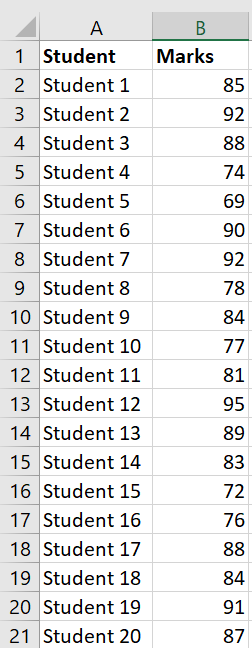
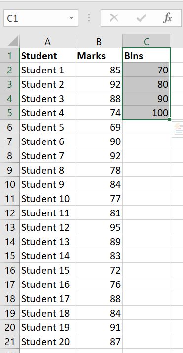
Below is an example of a dataset. This data represents the scores out of 100 on a recent test for 20 students.
Follow the given steps to create a Histogram of the previous dataset in Excel:
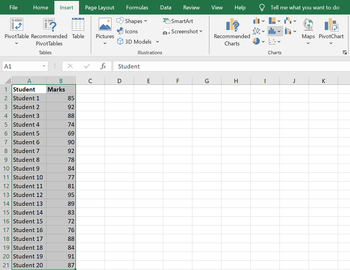
- Select the whole dataset
- Click on the Insert tab
- Head on to the Charts group and select the “Insert Static Chart” option.
- Under the ‘Histogram’ group, select the ‘Histogram Chart’ icon.
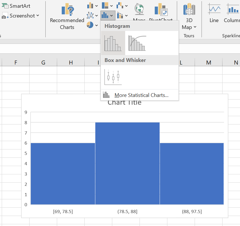
This is the Histogram that you will get after following the above steps.
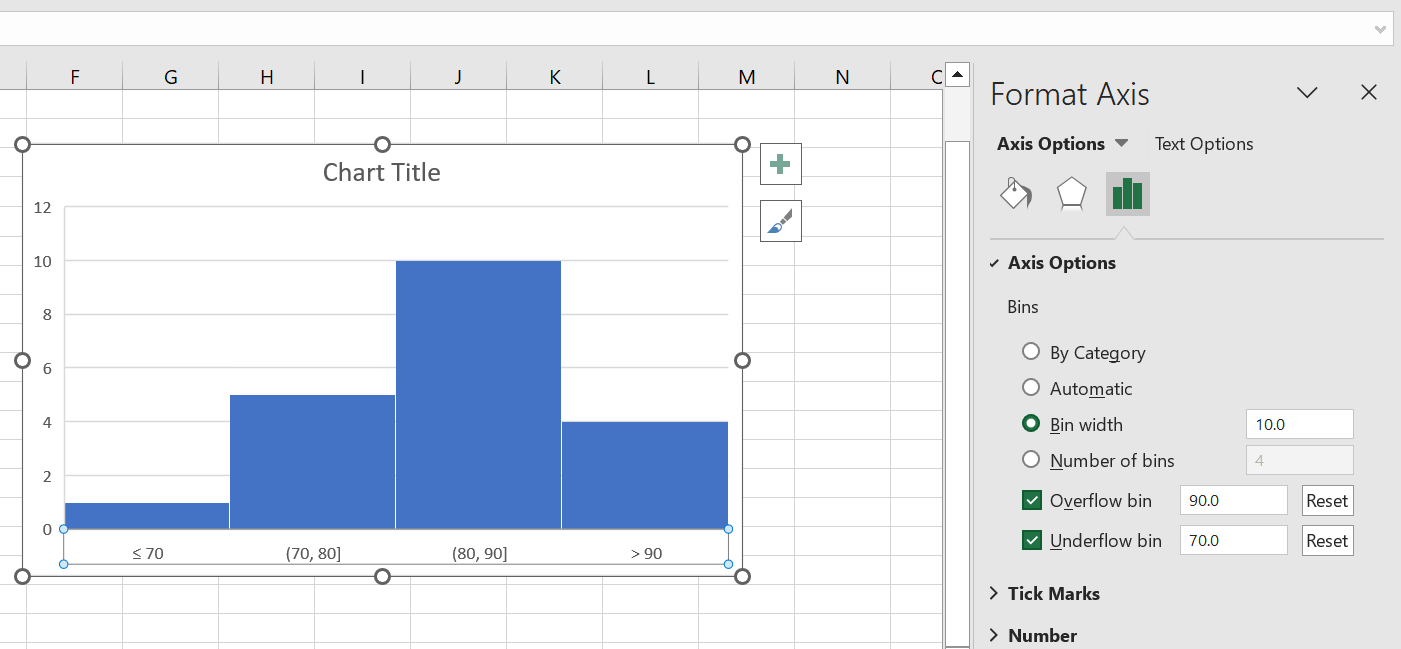
Now, you might want to format this Histogram. To format the Histogram, follow the given steps:
- Take your cursor on top of the ‘X-Axis’ and right-click. You will find an option called ‘Format Axis,’ which you need to click on.
- Select the “Axis Options” category.
- Put the Bin width as “10” (or as per your desired width).
- The value you put in the Underflow bin is the value from which the bins will start. Here, I have selected “70” as the Underflow bin value.
- The value you put in the Overflow bin is equivalent to or above the values shown in the final bin. I have selected “90” as the Overflow bin value.
Create Histogram in Excel Using the Data Analysis ToolPak
You can use this method in any version of Excel. You can make a histogram with the Data Analysis ToolPak, by installing the Analysis ToolPak add-in first.
How to Install the Data Analysis ToolPak?
Follow the given steps to install the Data Analysis ToolPak:
- Go to the ‘Files tab’ and click ‘Options.’
- Select the ‘Add-ins’ option.
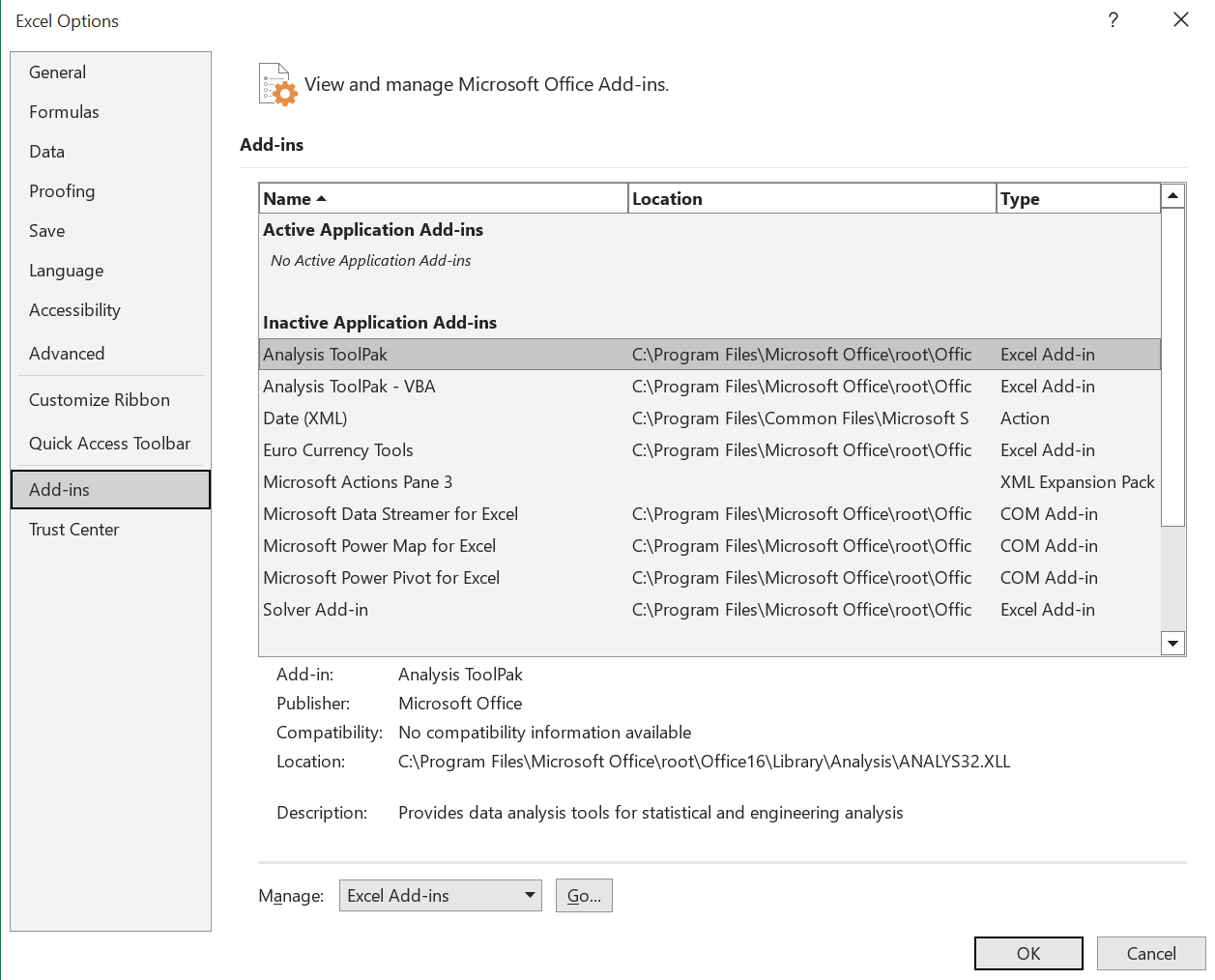
- Click on the ‘Analysis ToolPak’ and then click on ‘OK.’
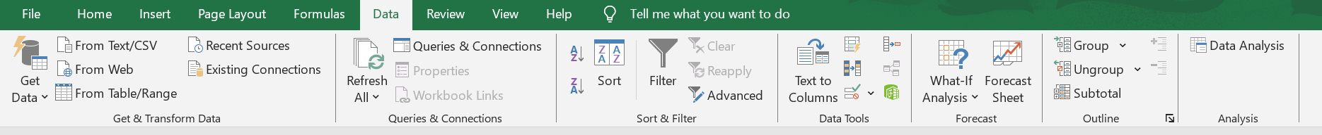
Now, you can access the ‘Analysis ToolPak’ from the ‘Data’ tab in the ‘Analysis’ group.
Using Data Analysis ToolPak to create a Histogram
Let us use the same dataset to create a histogram using ‘ToolPak’.
First, you need to set the data intervals where you would find the data frequency. These intervals are called ‘Bins’.
In the given dataset, the bins would make the marks’ intervals.
In a new column, you need to type in the values of the bins, as shown below.
Now, once you have set all the data, you can start following the given steps to create histogram in Excel:
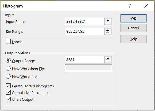
- Click on the ‘Data’ tab
- Go to the ‘Analysis’ group and select ‘Data Analysis.’
- As the ‘Data Analysis’ dialogue box opens, select the Histogram option.
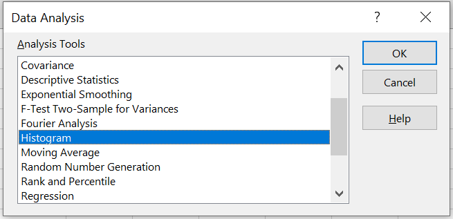
- Click ‘OK.’
This will open up the Histogram dialogue box. Now that the dialogue box is open, you need to follow the given steps:
- Fill in the ‘Input Range’ (Marks in this case).
- Fill in the ‘Bin Range’ (Cells C2:C5).
- Let the checkbox named ‘Labels’ remain unchecked (It is only required to be checked when you add labels in your data section).
- Select the ‘Output Range’ for your Histogram.
- Click on the ‘Chart Output.’
- If you want your Histogram to be presented in descending order of frequency, you need to click on the ‘Pareto’ check box.
- If you want a cumulative frequency line to be added to your Histogram (which looks similar to a normal distribution curve in Excel), click on the ‘Cumulative Percentage’ box.
- Click ‘OK’.
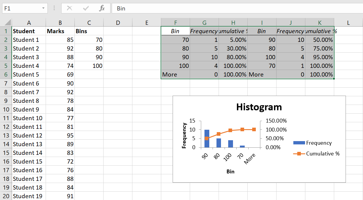
This will add your frequency distribution table along with the chart for the location that you specified.
How To Create a Histogram Using Excel Histogram Formula?
Excel formulas come in handy when you want to make a dynamic histogram (that gets updated when you alter the data).
I am going to show you how to use the Excel Histogram formula and the FREQUENCY function to create a dynamic Excel Histogram chart.
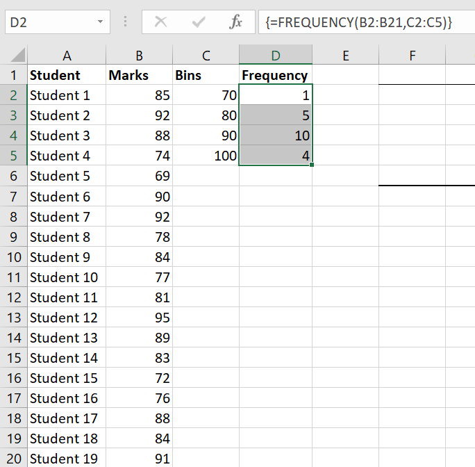
Here, you will also use the same student marks data to make the data intervals (bins) where you want to display the frequency.

The Excel Histogram formula for calculating the frequency of each interval is as follows:
=FREQUENCY(B2:B21,C2:C5)
This is an example of an array formula, so you will have to use Control + Shift + Enter.
Follow the undermentioned steps to create Histogram in Excel using the FREQUENCY formula:
- First, you need to select the adjacent cells of the bins’ column (D2:D5).
- Now type in the FREQUENCY formula: =FREQUENCY(B2:B21,C2:C5).
- Press Control + Shift + Enter.
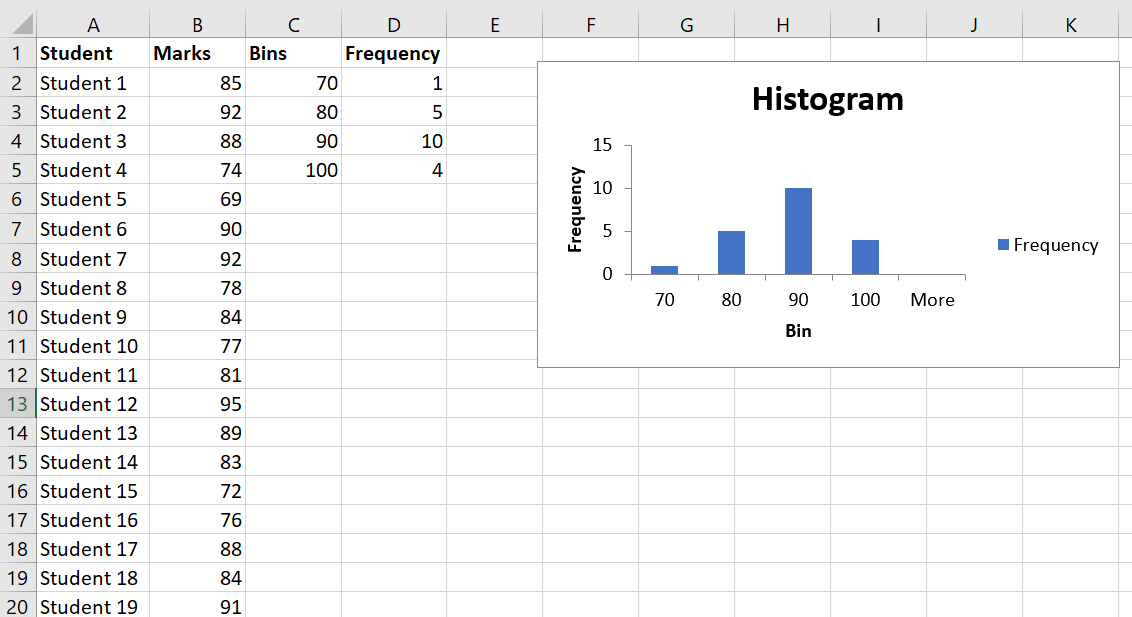
Now, with this result, you can create a simple histogram.
Final Words
Learning how to make histograms in Excel is far more than simply organizing numbers and clicking through menus; it's about mastering data to tell its story compellingly and clearly.
I sure hope this Histogram Excel tutorial has been insightful. In my experience, Excel has all the robust tools you need as a data analyst to uncover patterns, analyze trends, and make informed decisions.
If you are looking to deepen your expertise in Excel, consider enrolling in the free certified course that upGrad offers. upGrad also offers other accredited programs that can significantly enrich your understanding and enhance your skill set, preparing you for advanced data handling in any professional setting.
Frequently Asked Questions
1. How do I create a histogram in Excel?
To make a histogram in Excel, organize your data into a single column. Next, navigate to the "Insert" tab, choose "Insert Statistic Chart," and pick "Histogram.". Modify the bin range and more by selecting the histogram and accessing the settings in "Histogram Format." The process is explained in detail in the preceding sections of this tutorial. How do you construct a histogram?
2. How do you construct a histogram?
To construct a histogram, first gather and sort your data into a single column. Then, select the range of data, navigate to the "Insert" tab, choose "Chart," and select "Histogram" from the available options. Excel will create the histogram automatically. You can format the bin sizes and appearance by adjusting the settings in the chart tools that appear. How do I make a histogram in Excel with two sets of data?
3. How do I make a histogram in Excel with two sets of data?
To make a histogram in Excel with two sets of data, first, ensure each dataset is in a separate column. Highlight both columns, go to the "Insert" tab, and select "Histogram" under the "Chart" options. Excel will create a histogram for each dataset. How do you draw a histogram curve in Excel?
4. How do you draw a histogram curve in Excel?
To draw a histogram curve in Excel, begin by placing your data into a column and then selecting that data. Proceed to the "Insert" tab and click on "Histogram" under the "Charts" section to generate your histogram. Enhance the histogram by right-clicking on the bars, selecting "Add Data Labels" for frequency visibility, and then choosing "Add Trendline" to introduce a curve that fits your data. How do I calculate histogram bins in Excel?
5. How do I calculate histogram bins in Excel?
To set up histogram bins in Excel, first find your data range by subtracting the minimum value from the maximum value. Decide how many bins you need and divide the range by this number to find the bin width. Enter these bin limits into a new column. To create the histogram, select your data and the bin range columns, go to the "Insert" tab, and choose "Histogram" from the "Charts" section. What is a histogram in Excel and how can you use it?
6. What is a histogram in Excel and how can you use it?
A histogram displays the frequency distribution in Excel of numerical data through bars, each representing a data range. It is used to assess the distribution, identify central tendencies, spot outliers, and compare datasets visually. This helps understand patterns such as skewness, variability, and differences between data sets. How do I make a horizontal histogram in Excel?
7. How do I make a horizontal histogram in Excel?
Create a horizontal histogram in Excel by entering data, inserting a histogram chart, changing the chart type to horizontal, and customizing as needed. You will find a detailed guide in this tutorial. How do I bin data in Excel?
8. How do I bin data in Excel?
To bin data in Excel, determine the desired number and range of bins, then use the FREQUENCY function with the data and bin ranges to calculate frequencies, followed by creating a column chart from the resulting frequency data for visual representation.. To bin data in Excel, determine the desired number and range of bins, then use the FREQUENCY function with the data and bin ranges to calculate frequencies, followed by creating a column chart from the resulting frequency data for visual representation.. How do you create a normal distribution in Excel?
9. How do you create a normal distribution in Excel?
To create a normal distribution curve in Excel, input x-values and use the NORM.DIST function to generate corresponding y-values, then insert a "Scatter with Smooth Lines" chart, and customize the chart for clarity, visually representing the bell-shaped curve of the distribution. To create a normal distribution curve in Excel, input x-values and use the NORM.DIST function to generate corresponding y-values, then insert a "Scatter with Smooth Lines" chart, and customize the chart for clarity, visually representing the bell-shaped curve of the distribution.

Author|15 articles published


upGrad Learner Support
Talk to our experts. We are available 7 days a week, 10 AM to 7 PM
Indian Nationals
Foreign Nationals
Disclaimer
The above statistics depend on various factors and individual results may vary. Past performance is no guarantee of future results.
The student assumes full responsibility for all expenses associated with visas, travel, & related costs. upGrad does not .