All courses
Agentic AI
Agentic AI

IIIT Bangalore
Executive Programme in Generative AI for LeadersArtificial Intelligence
Degree / Exec. PG

IIIT Bangalore
Executive Diploma in Machine Learning and AI
OPJ Global University
Master’s Degree in Artificial Intelligence and Data Science
Liverpool John Moores University
Master of Science in Machine Learning & AI
Golden Gate University
DBA in Emerging Technologies with Concentration in Generative AIExecutive Certificate

IIITB & IIM, Udaipur
Chief Technology Officer & AI Leadership ProgrammeIIIT Bangalore
Executive Programme in Generative AI for Leaders
upGrad | Microsoft
Gen AI Foundations Certificate Program from MicrosoftupGrad | Microsoft
Gen AI Mastery Certificate for Data AnalysisupGrad | Microsoft
Gen AI Mastery Certificate for Software DevelopmentupGrad | Microsoft
Gen AI Mastery Certificate for Managerial ExcellenceOffline Bootcamps

upGrad
Data Science and AI-MLDoctorate
For All Domains
IIITB & IIM, Udaipur
Chief Technology Officer & AI Leadership Programme
Swiss School of Business and Management
Global Doctor of Business Administration from SSBM
Edgewood University
Doctorate in Business Administration by Edgewood UniversityGolden Gate University
Doctor of Business Administration From Golden Gate University
Rushford Business School
Doctor of Business Administration from Rushford Business School, SwitzerlandGolden Gate University
Master + Doctor of Business Administration (MBA+DBA)-d9bdeff6165f4eb1ba2adcebde78e961.svg)
University of Waterloo
Chief Technology and AI Officer ProgramLeadership / AI
Golden Gate University
DBA in Emerging Technologies with Concentration in Generative AIMachine Learning
Machine Learning
Data Science
Degree / Exec. PG
O.P Jindal Global University
Master’s Degree in Artificial Intelligence and Data ScienceIIIT Bangalore
Executive Diploma in Data Science & AILiverpool John Moores University
Master of Science in Data ScienceExecutive Certificate
upGrad | Microsoft
Gen AI Foundations Certificate Program from MicrosoftupGrad | Microsoft
Gen AI Mastery Certificate for Data AnalysisupGrad | Microsoft
Gen AI Mastery Certificate for Software DevelopmentupGrad | Microsoft
Gen AI Mastery Certificate for Managerial ExcellenceupGrad | Microsoft
Gen AI Mastery Certificate for Content CreationOffline Bootcamps
upGrad
Data Science and AI-MLupGrad
Data AnalyticsMBA
Masters

Paris School of Business
Master of Science in Business Management and TechnologyO.P.Jindal Global University
MBA (with Career Acceleration Program by upGrad)Edgewood University
MBA from Edgewood UniversityO.P.Jindal Global University
MBA from O.P.Jindal Global UniversityGolden Gate University
Master + Doctor of Business Administration (MBA+DBA)Executive Certificate

IMT, Ghaziabad
Advanced General Management ProgramMarketing
Executive Certificate
Offline Bootcamps
upGrad
Digital MarketingManagement
Degree
O.P Jindal Global University
MSc in International Accounting & Finance (ACCA integrated)Paris School of Business
Master of Science in Business Management and Technology
Golden Gate University
Master of Arts in Industrial-Organizational PsychologyExecutive Certificate

IIIT-B & IIM, Udaipur
Chief Technology Officer & AI Leadership Programme
IIM Kozhikode
Human Resource Analytics Course from IIM-KupGrad | Microsoft
Gen AI Foundations Certificate Program from MicrosoftEducation
Education

Northeastern University
Master of Education (M.Ed.) from Northeastern UniversityEdgewood University
Doctor of Education (Ed.D.)Edgewood University
Master of Education (M.Ed.) from Edgewood UniversityCertifications
Project Management
Certification

Knowledgehut
Leadership And Communications In ProjectsKnowledgehut
Microsoft Project 2007/2010-ae8d039bbd2a41318308f8d26b52ac8f.svg)
Knowledgehut
Financial Management For Project ManagersKnowledgehut
Fundamentals of Earned Value Management (EVM)Knowledgehut
Fundamentals of Portfolio ManagementKnowledgehut
Fundamentals of Program Management-35c169da468a4cc481c6a8505a74826d.webp&w=128&q=75)
Knowledgehut
CAPM® CertificationsKnowledgehut
Microsoft® Project 2016Certifications & Trainings
-7f4b4f34e09d42bfa73b58f4a230cffa.webp&w=128&q=75)
Knowledgehut
PMP® CertificationKnowledgehut
PMI-RMP® CertificationKnowledgehut
PMP Renewal Learning PathKnowledgehut
Oracle Primavera P6 V18.8Knowledgehut
Microsoft® Project 2013Knowledgehut
PfMP® Certification CourseKnowledgehut
Project Planning and MonitoringPrince2 Certifications

Knowledgehut
PRINCE2® FoundationKnowledgehut
PRINCE2® PractitionerKnowledgehut
PRINCE2 Agile Foundation and PractitionerKnowledgehut
PRINCE2 Agile® Foundation CertificationKnowledgehut
PRINCE2 Agile® Practitioner CertificationManagement Certifications
Knowledgehut
Project Management Masters Certification ProgramKnowledgehut
Change ManagementKnowledgehut
Project Management TechniquesKnowledgehut
Product Management Certification ProgramKnowledgehut
Project Risk Management- Study abroad
- Offline centres
- uGSOT - B.Tech
More


27. Columns in Excel
33. Count In Excel
49. Slicers in Excel
54. Solver in Excel
56. Macros In Excel
Pivot Charts in Excel
Spreadsheets filled with figures are a nightmare to understand. Now, what if you could change that data into a visual narrative, exposing the trends and patterns that are not visible on the surface? That's the special thing about pivot charts in Excel. This brilliant tool acts as data interpreters, summarizing and visualizing the information in a manner that is interactive and easy to understand.
With pivot charts, you can be sure that you have fully understood your data, you can notice the most important trends and can make data-based decisions with more certainty. This pivot chart Excel tutorial will give you the necessary information and the steps to produce pivot charts in Excel, thus helping you master the data that you will be able to use in the best possible way.
What are Pivot Charts used for in Excel?
Pivot charts are versatile and can be used for various purposes, including:
1. Identifying trends and patterns
Pivot charts in Excel can ascertain the linkages among various data points that are present in your spreadsheet. A pivot chart is a perfect tool to find out if there is a connection between sales figures and different regions or product categories.
2. Comparing categories
For example, if you see the sales data of the different product categories, create a pivot chart in Excel which will let you compare the performances of the sales in the different categories, so you will be able to see which of them are doing well and which of them need improvement.
3. Creating dynamic reports
Pivot charts in Excel are interactive and hence, you can focus on the data or you can change the way it is summarized. This is why they are the perfect tool for producing reports that are adaptable to your requirements.
Where is the Pivot Chart in Excel?
The pivot chart button and other important features of the Excel program are sometimes difficult to locate whether to your version or from the moment you first launched the program. Here's a quick guide to pinpoint its location:
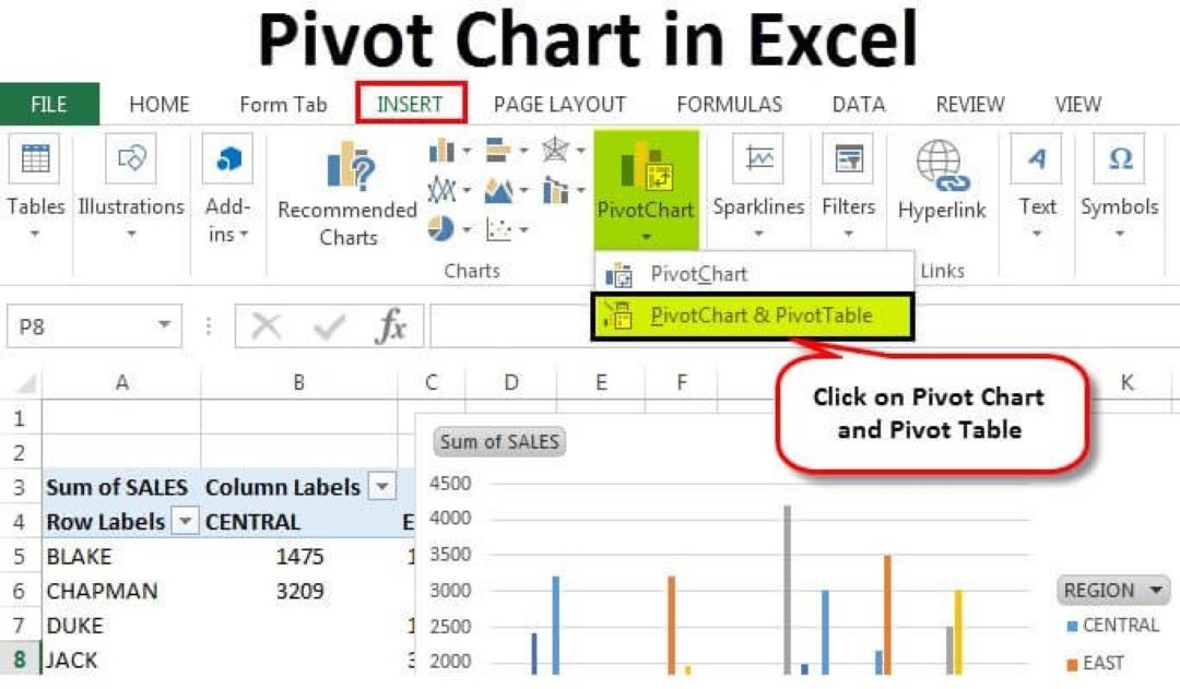
1. Excel 2010 and Later
The Chart Wizard button is embedded in the programmed (Excel 2010 or higher versions ) tab. Try to find the statistics, or charts group, inside this tab. And not to be forgotten is the pivot chart icon which you will find in a peaceful neighborhood with other chart input alternatives besides a chart grid presenting examples of a pivot table.
2. Excel 2007
The way of its execution by the Excel 2007 users can be a little bit different. Go to the “Insert” tab as the chart group is displayed on the right-hand. However, the table group for your use is located on the left-hand side. Follow the flow of your spreadsheet as you will see the pivot chart button here, and from your tables, you'll be deploying visualization capabilities.
Remember: Software is developed in continuous extensions, therefore the path to the file can change in future versions of the Excel software. Also, the core capability of the button, providing you the option of generating, analyzing, and visually pleasing charts from your data, as its initial purpose, has not changed. However, if this button is unknown to you or you don't know where it is located in your version of the spreadsheet, a quick online search or just going through the Excel menus should always reveal its location. Additionally, you can refer to this Excel tutorial for guidance.
How to Create a Pivot Chart in Excel
- Select your data: Initially, you have to choose the data range that you want to put into the pivot chart. The data range you are referring to should be the table headers.
- Insert the pivot chart: Click on the pivot chart button and then select the place for the pivot chart (a new or an existing sheet).
- Drag fields to the rows and columns: The pivot table field list will be on the right side of the Excel window. In the row and column sections of the pivot table Fields pane, choose the fields you want to show.
- Filter and Customize: In addition, you can choose your pivot chart according to the filter that is located in the pivot table fields pane. Apart from that, you can also modify the chart type, style the chart components, and put the data labels into the chart as you wish.
Excel Pivot Chart Examples
Here are a few examples of how pivot charts can be used to analyze data in Excel:
1. Sales Analysis by Region
Think of a spreadsheet that has the sales data for various regions and product categories. A pivot chart in Excel can be used to visualize the variations in sales in various regions. This will enable you to discern which areas are doing good and which ones might need some extra effort.
2. Customer Analysis by Demographics
From the customer data with demographics like age, location, and purchase history, you can create a pivot chart in Excel to analyze the customer buying trend. To be precise, you can find out if there are any age groups or places that are more likely to buy the particular products.
Pivot Chart Formatting
The process of creating your pivot chart is ready, and now you can modify its design to make it more attractive and comprehensible. Here are some formatting options you can use:
1. Change the chart type
Excel has many chart types that are used to show data, such as bar charts, column charts, pie charts, and so on. You can pick the kind of chart that is the most appropriate for the kind of data you are trying to present.
2. Format chart elements
You can set up the colors, fonts, and borders of the different parts of charts such as the chart titles, axis labels, and data labels.
3. Add data labels
Labels of the data put forth the real data values inside the chart. This way, people will be able to grasp the data points without the need to check the legend.
Wrapping Up
Pivot charts in Excel are used to transform raw data into graphical presentations of the data. Through the proficient usage of pivot charts, you will be able to comprehend your data more deeply, discover the trends, and make data-based decisions with a higher rate of confidence. Thus, the next time you are dealing with big data in Excel, you should not be hesitant to use the pivot charts to your advantage!
Nevertheless, to advance in data analysis and Excel skills, you should be ready to overdrive your data analysis skills and become a data analysis pro. UpGrad provides a wide range of Data Analysis and Business Intelligence courses that will help you get a step ahead. These schemes are constructed by industry specialists and give the practical knowledge and tools that you need to succeed in today's data-driven world. Whatever your level is, whether you are a newbie or a veteran, there is a program that fits your needs exactly.
Frequently Asked Questions
1. What is the difference between a Pivot Table and a Pivot Chart?
A pivot chart in Excel is a visual representation of the data in a pivot table, on the contrary, a pivot chart is a graphic that shows the data in a pivot table. It inculcates a way of recognizing the patterns and trends in the data more conveniently. You can view a pivot table as the backstage worker and the pivot chart as the finished product, which is the final, polished, and eye-catching presentation of the data.
2. What are the different types of Pivot Charts in Excel?
Excel provides several chart types that can be used for pivot charts creation. Some of the most common ones include: ● Bar charts: The comparison of categories of data is the outstanding feature of this thing. ● Column charts: On the same level as bar charts but with vertical bars instead of horizontal bars. ● Line charts: The best choice for illustrating trends over time is the time series analysis. ● Pie charts: The usefulness of pie charts in the representation of proportions of the whole is undeniable.
3. What is VLOOKUP used for?
The VLOOKUP is a function in Excel used for vertical lookups. This way, you can search for a particular value in the leftmost column of a table and get a matching value from another column in the same row.
4. How does HLOOKUP work?
HLOOKUP is the other lookup function in Excel, whereas, LLOOKUP is for vertical lookups. It looks for a given value in the first row of the table and gives the corresponding value from the same column but in a different row.
5. How to use INDEX in Excel?
The INDEX function enables you to extract a certain value from a range of cells by providing the row and column number you want. It is mostly used together with other functions such as MATCH to construct more sophisticated formulas.
6. How do I find duplicates in Excel?
There are a couple of ways to locate the same value in Excel. You can employ the conditional formatting feature to draw attention to the duplicate entries. On the other hand, you can apply the advanced filter on the data tab or use formulas like COUNTIF or COUNTIFS to find the rows with duplicate values. Refer to these Excel tips and tricks for more information. There are a couple of ways to locate the same value in Excel. You can employ the conditional formatting feature to draw attention to the duplicate entries. On the other hand, you can apply the advanced filter on the data tab or use formulas like COUNTIF or COUNTIFS to find the rows with duplicate values. Refer to these Excel tips and tricks for more information.

Author|15 articles published


upGrad Learner Support
Talk to our experts. We are available 7 days a week, 10 AM to 7 PM
Indian Nationals
Foreign Nationals
Disclaimer
The above statistics depend on various factors and individual results may vary. Past performance is no guarantee of future results.
The student assumes full responsibility for all expenses associated with visas, travel, & related costs. upGrad does not .