All courses
Agentic AI
Agentic AI

IIIT Bangalore
Executive Programme in Generative AI for LeadersArtificial Intelligence
Degree / Exec. PG

IIIT Bangalore
Executive Diploma in Machine Learning and AI
OPJ Global University
Master’s Degree in Artificial Intelligence and Data Science
Liverpool John Moores University
Master of Science in Machine Learning & AI
Golden Gate University
DBA in Emerging Technologies with Concentration in Generative AIExecutive Certificate

IIITB & IIM, Udaipur
Chief Technology Officer & AI Leadership ProgrammeIIIT Bangalore
Executive Programme in Generative AI for Leaders
upGrad | Microsoft
Gen AI Foundations Certificate Program from MicrosoftupGrad | Microsoft
Gen AI Mastery Certificate for Data AnalysisupGrad | Microsoft
Gen AI Mastery Certificate for Software DevelopmentupGrad | Microsoft
Gen AI Mastery Certificate for Managerial ExcellenceOffline Bootcamps

upGrad
Data Science and AI-MLDoctorate
For All Domains
IIITB & IIM, Udaipur
Chief Technology Officer & AI Leadership Programme
Swiss School of Business and Management
Global Doctor of Business Administration from SSBM
Edgewood University
Doctorate in Business Administration by Edgewood UniversityGolden Gate University
Doctor of Business Administration From Golden Gate University
Rushford Business School
Doctor of Business Administration from Rushford Business School, SwitzerlandGolden Gate University
Master + Doctor of Business Administration (MBA+DBA)-d9bdeff6165f4eb1ba2adcebde78e961.svg)
University of Waterloo
Chief Technology and AI Officer ProgramLeadership / AI
Golden Gate University
DBA in Emerging Technologies with Concentration in Generative AIMachine Learning
Machine Learning
Data Science
Degree / Exec. PG
O.P Jindal Global University
Master’s Degree in Artificial Intelligence and Data ScienceIIIT Bangalore
Executive Diploma in Data Science & AILiverpool John Moores University
Master of Science in Data ScienceExecutive Certificate
upGrad | Microsoft
Gen AI Foundations Certificate Program from MicrosoftupGrad | Microsoft
Gen AI Mastery Certificate for Data AnalysisupGrad | Microsoft
Gen AI Mastery Certificate for Software DevelopmentupGrad | Microsoft
Gen AI Mastery Certificate for Managerial ExcellenceupGrad | Microsoft
Gen AI Mastery Certificate for Content CreationOffline Bootcamps
upGrad
Data Science and AI-MLupGrad
Data AnalyticsMBA
Masters

Paris School of Business
Master of Science in Business Management and TechnologyO.P.Jindal Global University
MBA (with Career Acceleration Program by upGrad)Edgewood University
MBA from Edgewood UniversityO.P.Jindal Global University
MBA from O.P.Jindal Global UniversityGolden Gate University
Master + Doctor of Business Administration (MBA+DBA)Executive Certificate

IMT, Ghaziabad
Advanced General Management ProgramMarketing
Executive Certificate
Offline Bootcamps
upGrad
Digital MarketingManagement
Degree
O.P Jindal Global University
MSc in International Accounting & Finance (ACCA integrated)Paris School of Business
Master of Science in Business Management and Technology
Golden Gate University
Master of Arts in Industrial-Organizational PsychologyExecutive Certificate

IIIT-B & IIM, Udaipur
Chief Technology Officer & AI Leadership Programme
IIM Kozhikode
Human Resource Analytics Course from IIM-KupGrad | Microsoft
Gen AI Foundations Certificate Program from MicrosoftEducation
Education

Northeastern University
Master of Education (M.Ed.) from Northeastern UniversityEdgewood University
Doctor of Education (Ed.D.)Edgewood University
Master of Education (M.Ed.) from Edgewood UniversityCertifications
Project Management
Certification

Knowledgehut
Leadership And Communications In ProjectsKnowledgehut
Microsoft Project 2007/2010-ae8d039bbd2a41318308f8d26b52ac8f.svg)
Knowledgehut
Financial Management For Project ManagersKnowledgehut
Fundamentals of Earned Value Management (EVM)Knowledgehut
Fundamentals of Portfolio ManagementKnowledgehut
Fundamentals of Program Management-35c169da468a4cc481c6a8505a74826d.webp&w=128&q=75)
Knowledgehut
CAPM® CertificationsKnowledgehut
Microsoft® Project 2016Certifications & Trainings
-7f4b4f34e09d42bfa73b58f4a230cffa.webp&w=128&q=75)
Knowledgehut
PMP® CertificationKnowledgehut
PMI-RMP® CertificationKnowledgehut
PMP Renewal Learning PathKnowledgehut
Oracle Primavera P6 V18.8Knowledgehut
Microsoft® Project 2013Knowledgehut
PfMP® Certification CourseKnowledgehut
Project Planning and MonitoringPrince2 Certifications

Knowledgehut
PRINCE2® FoundationKnowledgehut
PRINCE2® PractitionerKnowledgehut
PRINCE2 Agile Foundation and PractitionerKnowledgehut
PRINCE2 Agile® Foundation CertificationKnowledgehut
PRINCE2 Agile® Practitioner CertificationManagement Certifications
Knowledgehut
Project Management Masters Certification ProgramKnowledgehut
Change ManagementKnowledgehut
Project Management TechniquesKnowledgehut
Product Management Certification ProgramKnowledgehut
Project Risk Management- Study abroad
- Offline centres
- uGSOT - B.Tech
More


6. CSS Text
8. CSS Images
9. CSS Float
10. CSS Form
11. CSS Inline Block
12. CSS Examples
13. CSS Dropdown
14. CSS Flexbox
16. CSS Cheat Sheet
17. CSS Variables
18. CSS Grid Layout
19. CSS Animation
20. CSS Frameworks
21. CSS Positioning
22. CSS Comment
23. CSS Gradients
CSS Navigation Bar
HTML uses anchor links to direct users from one page to another. However, these links are usually implemented without any style, which can make them look plain. To overcome this, we use CSS Style. By applying CSS to these navigation links, we can enhance their look, presentation, color, font, and space, making them more visually appealing and user-friendly.
Overview
A navigation bar is not just a link that directs you to other sections. It's a practical tool that can be within a webpage (or) move from one page to the other. A Navigation bar, also known as a Nav Bar, is an essential element in web design. Understanding how to implement it using CSS is not just a skill but a key to enhancing your website's usability and aesthetics.
Characteristics of CSS Navigation Bar
Below are some of the characteristics of the navbar in CSS:
- Layout Options: It has only two layout options. It can be positioned vertically or horizontally.
- Links for Navigation: The link for navigation can be an image, text, or buttons.
- Drop-Down Menus: This is one of the additional features of the navigation bar.
- Style: We can add stylings such as background color, padding, space, width, active hover color, fonts, and many other features using CSS.
- Responsive Design: It should be adjusted to various sizes and devices and be user-friendly for desktop and mobile devices.
- Interaction: We can add interactive options, such as changing the color when the mouse is placed on the menu.
Limitations of CSS Navigation Bar
Limitations of the CSS navigation bar are given below:
- Interaction is limited. We can produce fewer levels of interactions. However, multiple levels, like nested drop-down, etc, cannot be implemented.
- Compatibility issues with cross-browser. Because each browser responds differently to the CSS styles applied, it is not possible to implement unique styling everywhere.
- Responsive design challenges: due to the frequent changes that are required in CSS, we can alter every time to mobile and desktop and various devices.
- Animation implementations are limited. CSS can handle basic animations; however, creating complex ones is difficult.
- Styling the navbar in HTML and CSS will be quite complex.
- Navbar CSS may not adhere to all the guidelines. Hence, there will be some accessibility issues.
Types of Navigation Bar in HTML and CSS
Navbar can be implemented using HTML and CSS and using two significant categories.
- Horizontal Navbar
- Vertical Navbar
Navbar CSS is usually designed using two major tags of links: <ul> and <li>
<ul> refers to the unordered list.
<li> refers to the list of elements within the unordered list.
It will be implemented as the below example:
<ul>
<li><a href=”ref”> Home </a></li>
</ul>
The above example implements a list with a navigation to some pages. However, this will look very boring with simple navigation. Hence, we have to implement nav CSS to make this more styling.
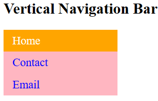
Implementing Vertical CSS Navigation Bar
Consider a simple example that implements different navigation using an unordered list. We have to style it with standard CSS-style vertical navigation.
- In the example below, we have implemented three navigations—Home, Contact, and Email.
- We have added background colors, font, spacing, styles, and width spaces as part of the navbar CSS styling.
- The list ‘li’ has parameters like displaying the font color of the anchor text. Displaying the anchor link as a block. This means the whole link area will be clickable.
- The list has also added some styling, such as whenever the user clicks any active element, it should be displayed as a separate color.
<!DOCTYPE html>
<html>
<head>
<style>
ul {
list-style-type: none;
margin: 0;
padding: 0;
width: 180px;
background-color: lightpink;
}
li a {
display: block;
color: blue;
font-size:18px;
padding: 7px 14px;
text-decoration: none;
}
.active{
background-color: orange;
color: white;
}
li a:hover {
background-color: orange;
color: white;
}
</style>
</head>
<body>
<h2>Vertical Navigation Bar</h2>
<ul>
<li><a href="#" class = "active">Home</a></li>
<li><a href = "#">Contact</a></li>
<li><a href = "#">Email</a></li>
</ul>
</body>
</html>
Output of the above code:
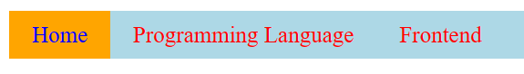
Implementing Horizontal CSS Navigation Bar
The horizontal CSS navigation bar is the horizontal list of anchor link implementation. This will generally be at the top of the page.
- In the example below, we have implemented three navigations—Home, Programming Language, and Frontend.
- We have added background colors to blue, font, spacing, styles, and width spaces as part of the navbar CSS styling.
- The list ‘li’ has parameters like displaying the anchor text in red font and the anchor link as a block. This means the whole link area will be clickable.
- The list has also added some styling to highlight the active color as orange.
- The tag overflow: hidden restricts the elements’ flow out of the list alignment.
- The property float: left is used to slide the elements of anchor links next to each other.
<!DOCTYPE html>
<html>
<head>
<style>
ul {
list-style-type: none;
margin: 0;
padding: 0px;
overflow: hidden;
background-color: light blue;
}
li {
float: left;
}
li a {
display: block;
color: red;
font-size:20px;
text-align: center;
padding: 10px 20px;
text-decoration: none;
}
.active{
background-color: orange;
color: blue;
}
li a:hover {
background-color: orange;
color: white;
}
</style>
</head>
<body>
<ul>
<li><a class="active" href="#home">Home</a></li>
<li><a href="#">Programming Language</a></li>
<li><a href="#">Frontend</a></li>
</ul>
</body>
</html>
Output of the above code:
Additional CSS Styles
For the same example, we can add more styles to the menu bar CSS. Some of the styles are explained below.
Adding Border Divider
In the above CSS implementation, if you want to split the menu with the border, you can implement the style below in the li. You can split the border using the right and left properties. Here, we have given border rights based on the size and color of the border.
li {
float: left;
border-right: 1px solid green;
}
Position Fixed
Use the property below to fix the menu and navigation bar in the same position, even if the user scrolls the page up and down.
ul {
position: fixed; }
Position Sticky
Use the property below to position the menu and navigation bar according to the user's scroll position.
ul {
position: sticky; }
Display Inline Block
Use the property to set the width and height of the element. This does not add a line break between the elements so that they can be placed right next to each other.
ul {
display: inline-block; }
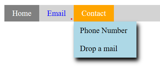
Drop-Down Navigation Bar
In the navigation bar using CSS, you can also add drop-down navigation in CSS. Let us consider the example we implemented for the horizontal navigation bar below. You can add a contact or phone number or drop mail and alter the code.
<!DOCTYPE html>
<html>
<head>
<style>
ul {
list-style-type: none;
margin: 0;
padding: 0;
overflow: hidden;
background-color: lightblue;
}
li {
float: left;
}
li a, .dropbtn {
display: inline-block;
color: blue;
font-size:18px;
text-align: center;
padding: 8px 10px;
text-decoration: none;
}
.active{
background-color: orange;
color: white;
}
li a:hover , .dropdown:hover .dropbtn{
background-color: orange;
color: white;
}
.dropdown-content {
display: none;
position: absolute;
background-color: lightblue;
min-width: 160px;
}
.dropdown-content a {
color: black;
padding: 12px 16px;
text-decoration: none;
display: block;
text-align: left;
}
.dropdown-content a:hover {
background-color: gray;
color:white;
}
.dropdown:hover .dropdown-content {
display: block;
}
h1,h2,h3{
text-align:center;
color: green;
}
</style>
</head>
<body>
<ul>
<li><a class="active" href="#home">Home</a></li>
<li><a href="#">Email</a></li>
<li class="dropdown">
<a href="#" class="dropbtn">Contact</a>
<div class="dropdown-content">
<a href="#">Phone Number</a>
<a href="#">Drop a mail</a>
</div>
</li>
</ul>
</body>
</html>
Output of the above code:
Final Thoughts
To make your website look better and work better, you should put a CSS navigation bar on it. You can change the links in the navigation bar by using different CSS styles that are described here. Doing so will make the user experience better. For web designers who want to make their sites more user-friendly and attractive, this is a must-know skill. To create a navigation bar, try out various styles and techniques; keep practicing until you find what works best for each type of site.
FAQs
1. What is the navigation bar in CSS?
A navigation bar is a link that directs a particular text (or image) from one page to another (or within the page itself).
2. How do I change the navigation bar position in CSS?
It can be implemented using different navigation bars, such as placing them vertically or horizontally (or fixing them by applying the respective CSS styling).
3. What is the navigation menu bar?
The navigation menu bar is found at the top of any website. It can be vertical or horizontal.
4. How do you center the navbar with CSS?
We can use two tags to center the navbar CSS using text-align: center and display: inline-block;
5. What is an example of a navigation bar?
6. What is the navigation bar size?
It is usually recommended that the maximum size be 16px and the medium be 14px. You can use default values or customize the size in your CSS.
7. What is the difference between the navigation bar and the menu?
A navigation bar is usually placed at the top of the website page, and a menu bar can be placed according to the implementation of the menus.
8. Is it a navigation bar or a navbar?
In CSS, we can also call the navigation bar a navbar.

Author|309 articles published


upGrad Learner Support
Talk to our experts. We are available 7 days a week, 10 AM to 7 PM
Indian Nationals
Foreign Nationals
Disclaimer
The above statistics depend on various factors and individual results may vary. Past performance is no guarantee of future results.
The student assumes full responsibility for all expenses associated with visas, travel, & related costs. upGrad does not .