For working professionals
For fresh graduates
- Study abroad
More
- Post Graduate Certificate in Data Science & AI (Executive)
- Gen AI Foundations Certificate Program from Microsoft
- Gen AI Mastery Certificate for Data Analysis
- Gen AI Mastery Certificate for Software Development
- Gen AI Mastery Certificate for Managerial Excellence
- Gen AI Mastery Certificate for Content Creation
- Post Graduate Certificate in Product Management from Duke CE
- Human Resource Analytics Course from IIM-K
- Global Master Certificate in Integrated Supply Chain Management
- Gen AI Foundations Certificate Program from Microsoft
- CSM® Certification Training
- CSPO® Certification Training
- PMP® Certification Training
- SAFe® 6.0 Product Owner Product Manager (POPM) Certification
- Post Graduate Certificate in Product Management from Duke CE
- Professional Certificate Program in Cloud Computing and DevOps
- Python Programming Course
- Executive Post Graduate Programme in Software Dev. - Full Stack
- AWS Solutions Architect Training
- AWS Cloud Practitioner Essentials
- AWS Technical Essentials
- The U & AI GenAI Certificate Program from Microsoft
2. HTML Basics
3. HTML Syntax
9. HTML Head
10. HTML Title
11. HTML Styles
12. HTML Paragraphs
13. HTML Symbols
14. HTML Emojis
15. HTML Formatting
16. HTML Entities
17. HTML Audio
18. HTML Images
19. HTML Lists
20. HTML Links
21. SVG in HTML
22. HTML Forms
23. HTML Video
24. HTML Canvas
25. Adjacency Lists
26. HTML Input Types
27. HTML Tables
31. HTML Layout
33. HTML Div
37. HTML Iframes
40. HTML Code
41. HTML Colors
42. HTML CSS
43. HTML Editors
44. HTML Examples
45. Class in HTML
46. HTML Exercises
47. HTML ID
49. HTML Table Style
50. HTML Script
Mastering HTML Page Layout: A Guide for Web Developers
A web page's layout frequently serves as the basis for its design, and web development is based on a mastery of HTML layout. The way that layout affects user experience and content display intrigues me more and more as I delve more into the vast field of web design. The layout is essential for achieving several goals, including a pleasing text-to-image ratio and easy navigation.
I'll walk you through the principles of layout in HTML in this tutorial, offer advice on best practices, and give you examples so you can create more helpful web pages. So let's get started.
Comprehending HTML Layout Structure
It's crucial to comprehend the fundamental structure of an HTML document while creating an HTML page layout. The arrangement and display of material on a webpage are determined by this structure. Let's dissect it into its constituent parts:
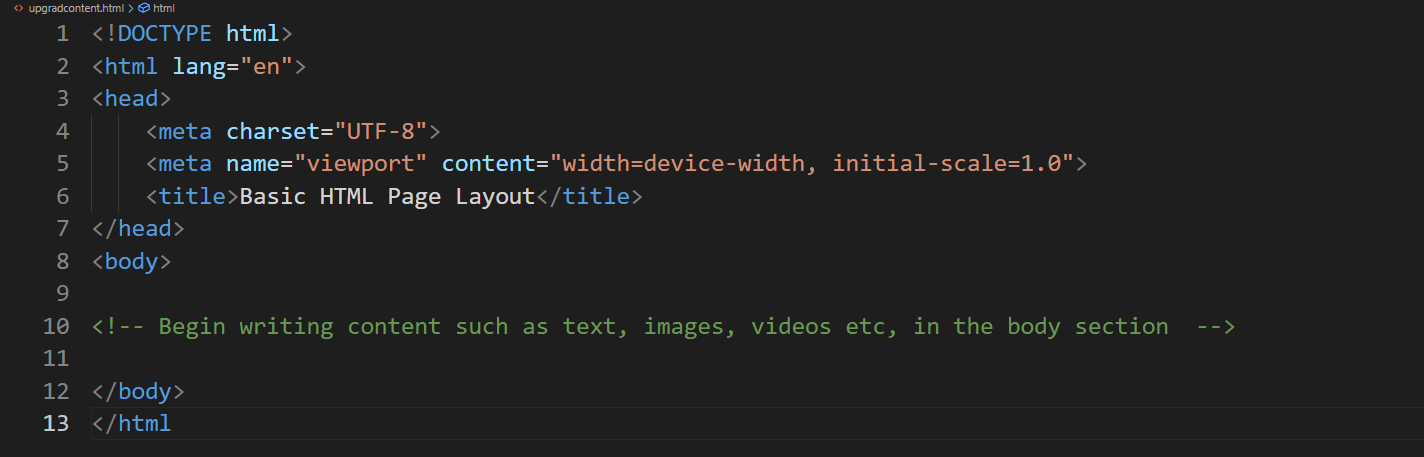
Basic HTML page layout
Before getting into specific style strategies, it's critical to comprehend the importance of document structure. HTML texts are organized hierarchically and have a distinct beginning, middle, and finish. HTML tags define this framework and dictate how the material is arranged.
- <!DOCTYPE> Declaration: This tag indicates the HTML version used and ensures proper browser rendering.
- <html> Tag: The root element encapsulates the entire HTML document.
- <head> Section: Contains metadata, including the document title, linked stylesheets, and scripts.
- <body> Section: This is where the content that users see is placed, including text, images, and interactive elements.
Here is an HTML example page layout example:
<!DOCTYPE html>
<html lang="en">
<head>
<meta charset="UTF-8">
<meta name="viewport" content="width=device-width, initial-scale=1.0">
<title>Basic HTML Page Layout</title>
</head>
<body>
<!-- Begin writing content such as text, images, videos etc, in the body section -->
</body>
</html>
Semantic HTML: Constructing with Intent
Assume you are constructing a home. There are windows, doors, and walls. Suppose someone now declared, "Build it without labels"? Who could tell which portion is a window or a door? Similarly, it's important to use HTML components in web development that explicitly state their purpose and content. We call this technique "semantic HTML."
Semantic HTML provides context for the material, improving accessibility and search engine optimization. These semantic clues assist search engines, like Google, in comprehending your content, which can increase the visibility of your website. Semantic tags also help a website layout HTML become more accessible by facilitating navigation for screen readers and other assistive technology.
Now, let's discuss some of the most essential semantic tags that you may come across often in your work with an HTML layout:
- <header>: Indicates the header section, which frequently has branding, navigation, or a logo.
- <nav>: Indicates a section that has links for navigation.
- <main>: This section houses the page's primary material.
- <footer>: This indicates that you are in the footer section, which often contains disclaimers or contact information.
- <article> and <section>: These divide the material into discrete articles or parts.
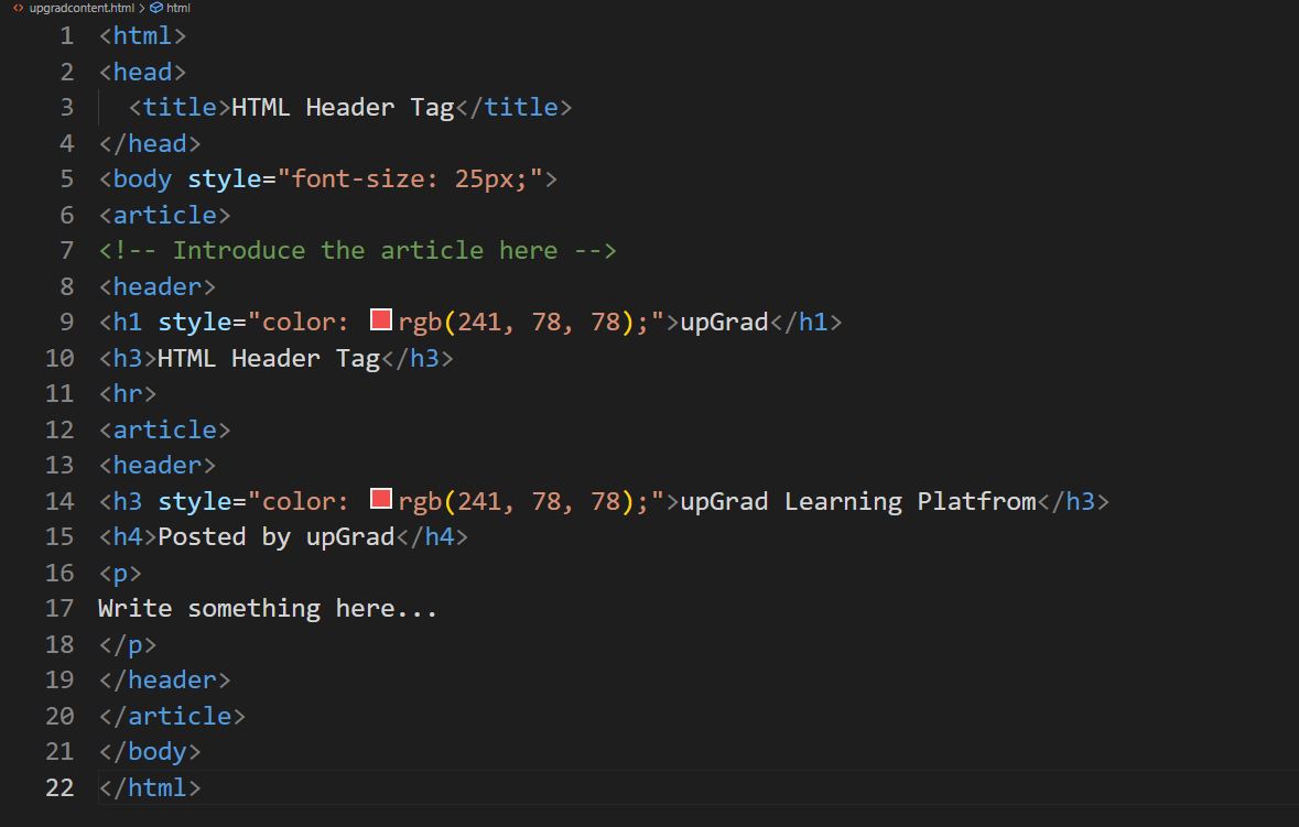
Header tag:
<html>
<head>
<title>HTML Header Tag</title>
</head>
<body style="font-size: 25px;">
<article>
<!-- Introduce the article here -->
<header>
<h1 style="color: rgb(241, 78, 78);">upGrad</h1>
<h3>HTML Header Tag</h3>
<hr>
<article>
<header>
<h3 style="color: rgb(241, 78, 78);">upGrad Learning Platfrom</h3>
<h4>Posted by upGrad</h4>
<p>
Write something here...
</p>
</header>
</article>
</body>
</html>
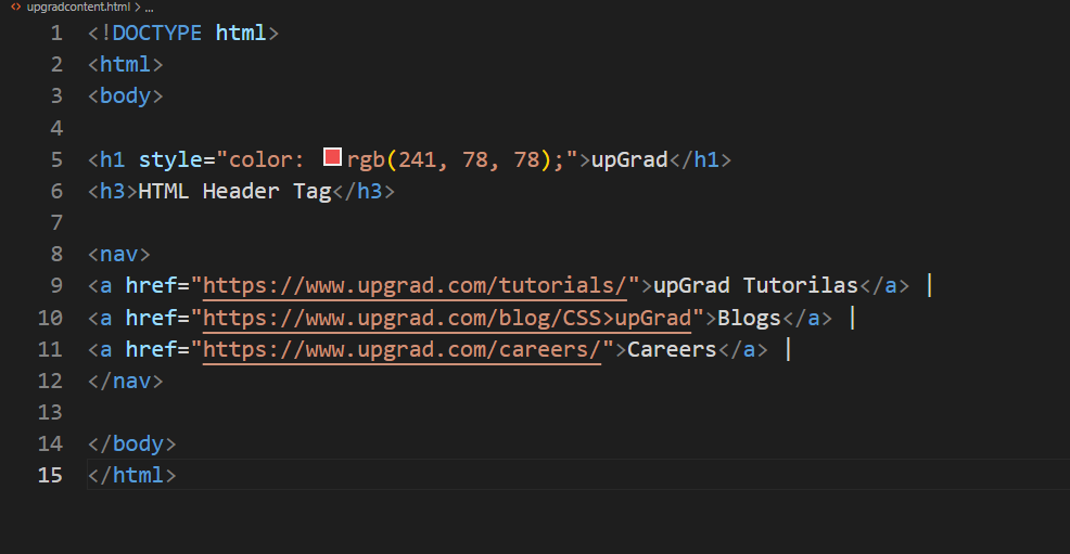
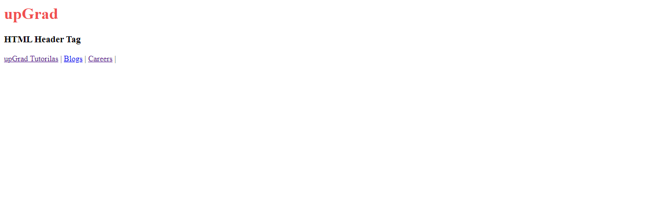
Nav tag:
<!DOCTYPE html>
<html>
<body>
<h1 style="color: rgb(241, 78, 78);">upGrad</h1>
<h3>HTML Header Tag</h3>
<nav>
<a href="https://www.upgrad.com/tutorials/">upGrad Tutorilas</a> |
<a href="https://www.upgrad.com/blog/CSS>upGrad">Blogs</a> |
<a href="https://www.upgrad.com/careers/">Careers</a> |
</nav>
</body>
</html>
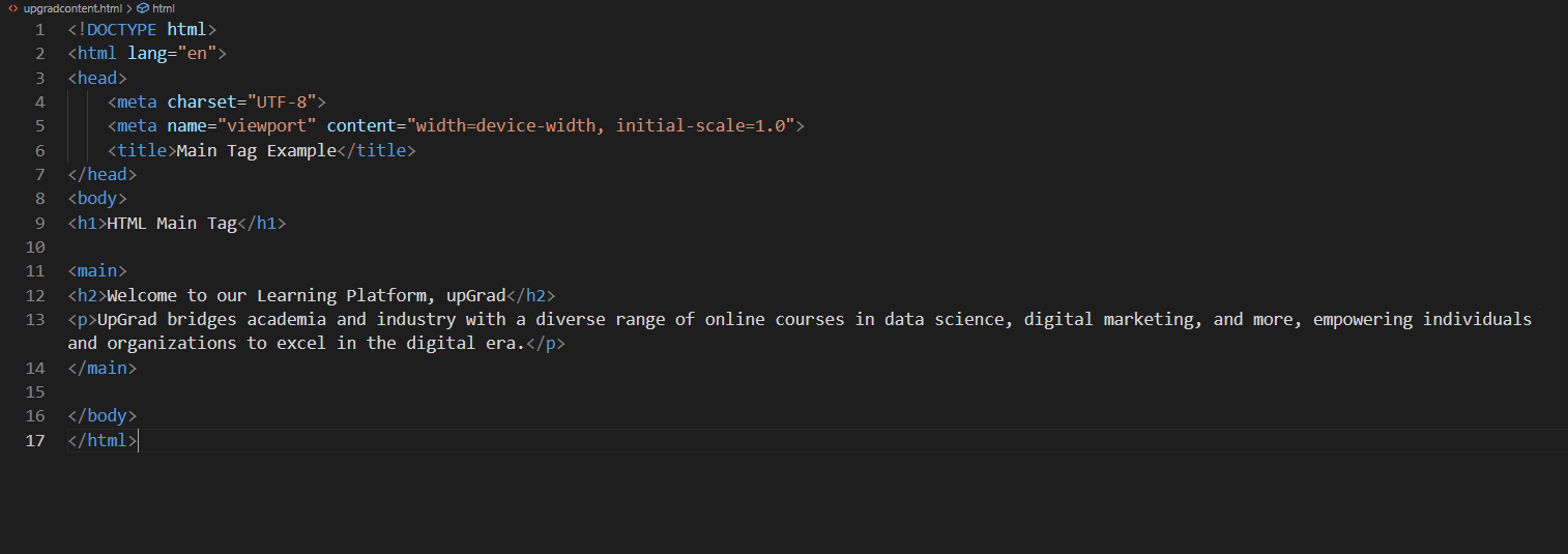
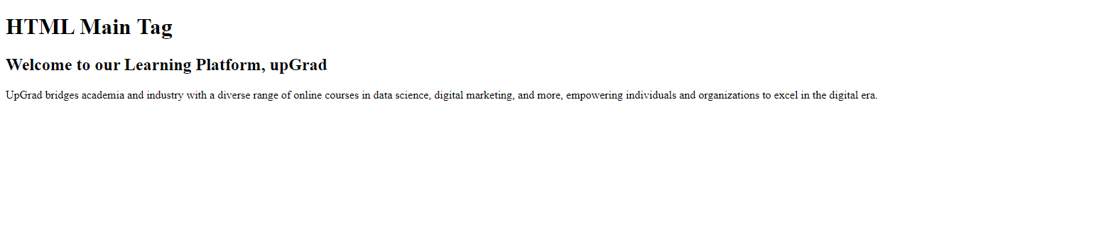
Main tag:
<!DOCTYPE html>
<html lang="en">
<head>
<meta charset="UTF-8">
<meta name="viewport" content="width=device-width, initial-scale=1.0">
<title>Main Tag Example</title>
</head>
<body>
<h1>HTML Main Tag</h1>
<main>
<h2>Welcome to our Learning Platform, upGrad</h2>
<p>UpGrad bridges academia and industry with a diverse range of online courses in data science, digital marketing, and more, empowering individuals and organizations to excel in the digital era.</p>
</main>
</body>
</html>
|
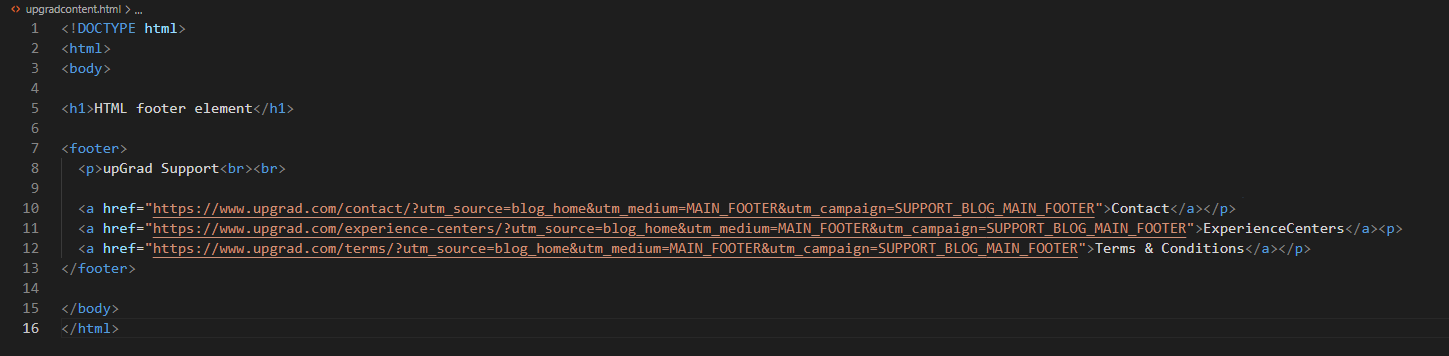
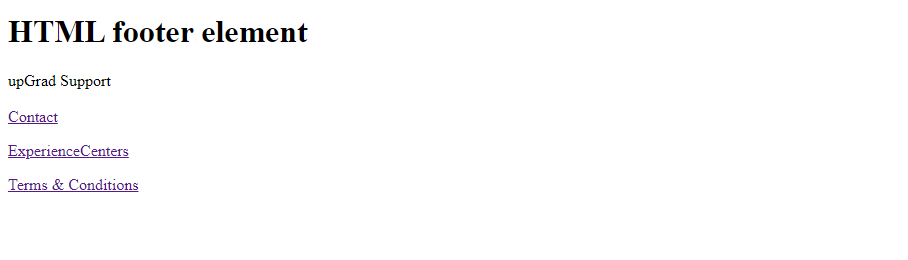
Footer tag:
<!DOCTYPE html>
<html>
<body>
<h1>HTML footer element</h1>
<footer>
<p>upGrad Support<br><br>

<a href="https://www.upgrad.com/contact/?utm_source=blog_home&utm_medium=MAIN_FOOTER&utm_campaign=SUPPORT_BLOG_MAIN_FOOTER">Contact</a></p>
<a href="https://www.upgrad.com/experience-centers/?utm_source=blog_home&utm_medium=MAIN_FOOTER&utm_campaign=SUPPORT_BLOG_MAIN_FOOTER">ExperienceCenters</a><p>
<a href="https://www.upgrad.com/terms/?utm_source=blog_home&utm_medium=MAIN_FOOTER&utm_campaign=SUPPORT_BLOG_MAIN_FOOTER">Terms & Conditions</a></p>
</footer>
</body>
</html>
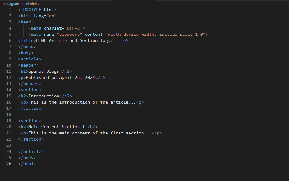
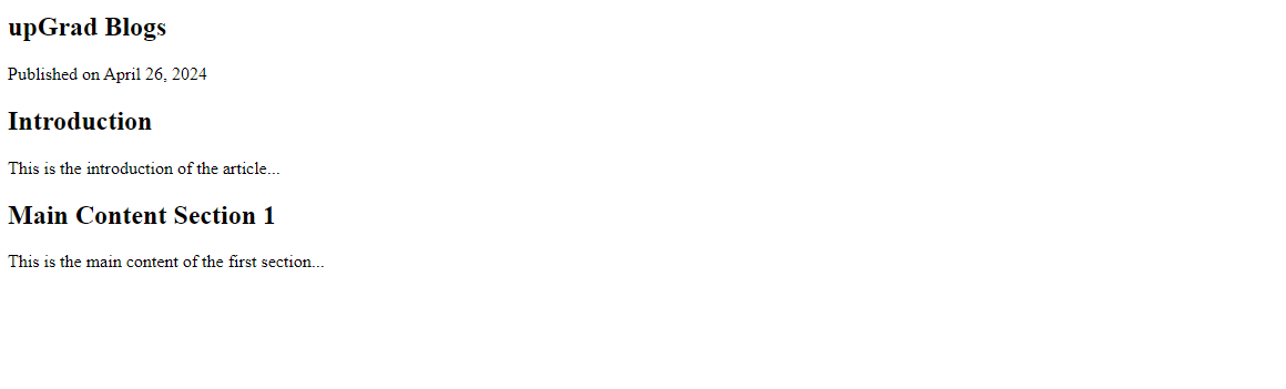
Article and section tag:
<!DOCTYPE html>
<html lang="en">
<head>
<meta charset="UTF-8">
<meta name="viewport" content="width=device-width, initial-scale=1.0">
<title>HTML Article and Section Tag</title>
</head>
<body>
<article>
<header>
<h1>upGrad Blogs</h1>
<p>Published on April 26, 2024</p>
</header>
<section>
<h2>Introduction</h2>
<p>This is the introduction of the article...<p>
</section>
<section>
<h2>Main Content Section 1</h2>
<p>This is the main content of the first section...</p>
</section>

</article>
</body>
</html>
By utilizing these semantic tags, you not only improve the accessibility and search engine optimisation of your website but also establish a more straightforward structure to comprehend and manage. Therefore, consider your website's narrative when creating the HTML layout and utilize semantic tags to provide context and clarity.
Exploring Layout Methods: Grid, Flexbox, Tables, and Divs
With the fundamentals under the belts, let's examine several methods for designing HTML page layouts. Tables, divs, Flexbox, and Grid will all be discussed; each has advantages.
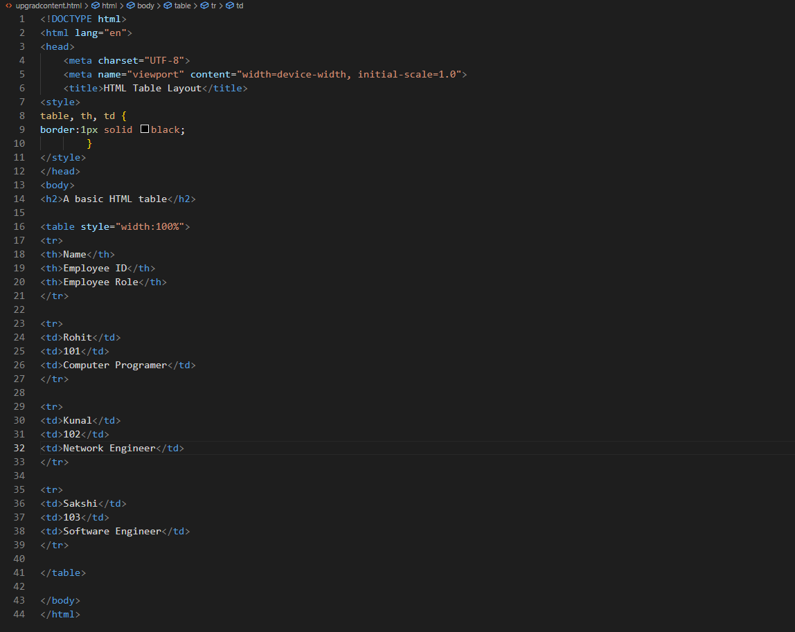
Table of HTML Layout
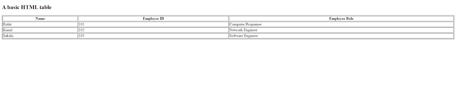
Think of tables as a grid for information. An HTML layout table is an excellent choice if you have data that naturally fits into rows and columns, such as a list of products, a class timetable, or a comparison chart. They keep things neat and make it easy for users to understand the information.
<!DOCTYPE html>
<html lang="en">
<head>
<meta charset="UTF-8">
<meta name="viewport" content="width=device-width, initial-scale=1.0">
<title>HTML Table Layout</title>
<style>
table, th, td {
border:1px solid black;
}
</style>
</head>
<body>
<h2>A basic HTML table</h2>
<table style="width:100%">
<tr>
<th>Name</th>
<th>Employee ID</th>
<th>Employee Role</th>
</tr>

<tr>
<td>Rohit</td>
<td>101</td>
<td>Computer Programer</td>
</tr>
<tr>
<td>Kunal</td>
<td>102</td>
<td>Network Engineer</td>
</tr>
<tr>
<td>Sakshi</td>
<td>103</td>
<td>Software Engineer</td>
</tr>
</table>
</body>
</html>
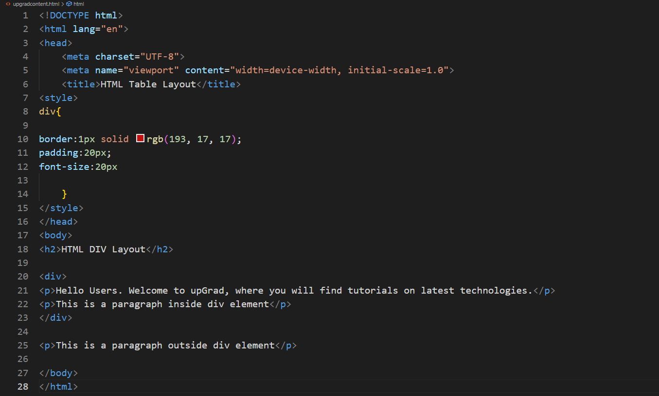
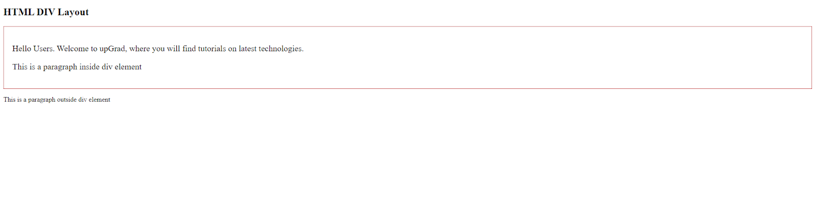
HTML Layout Using Div
One block-level element with other components in place is the tag. It's an essential component needed to create HTML layouts. This is a simple illustration of a div layout HTML:
Code:
<!DOCTYPE html>
<html lang="en">
<head>
<meta charset="UTF-8">
<meta name="viewport" content="width=device-width, initial-scale=1.0">
<title>HTML Table Layout</title>
<style>
div{
border:1px solid rgb(193, 17, 17);
padding:20px;
font-size:20px
}
</style>
</head>
<body>
<h2>HTML DIV Layout</h2>
<div>
<p>Hello Users. Welcome to upGrad, where you will find tutorials on latest technologies.</p>
<p>This is a paragraph inside div element</p>
</div>
<p>This is a paragraph outside div element</p>
</body>
</html>
HTML Flex Layout
One potent layout concept that lets you distribute and align items inside a container is called Flexbox. It offers an adaptable method for making responsive layouts. This illustrates a Flexbox layout:
<!DOCTYPE html>
<html>
<head>
<title>HTML Flexbox Layout</title>
<style>
.flex-container {
display: flex;
background-color: #d91717;
}

.flex-container div {
background-color: rgb(215, 242, 109);
margin: 10px;
padding: 10px;
}
</style>
</head>
<body>
<h2>HTML Flexbox Layput</h2>
<h4>Flexbox</h4>
<div class="flex-container">
<div>Item1</div>
<div>Item2</div>
<div>Item3</div>
</div>
</body>
</html>
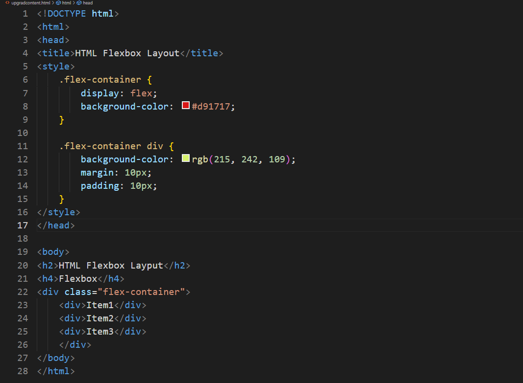
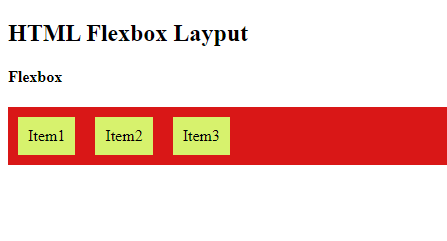
Flexbox is perfect for responsive design as it lets you create layouts that adjust to various screen sizes.
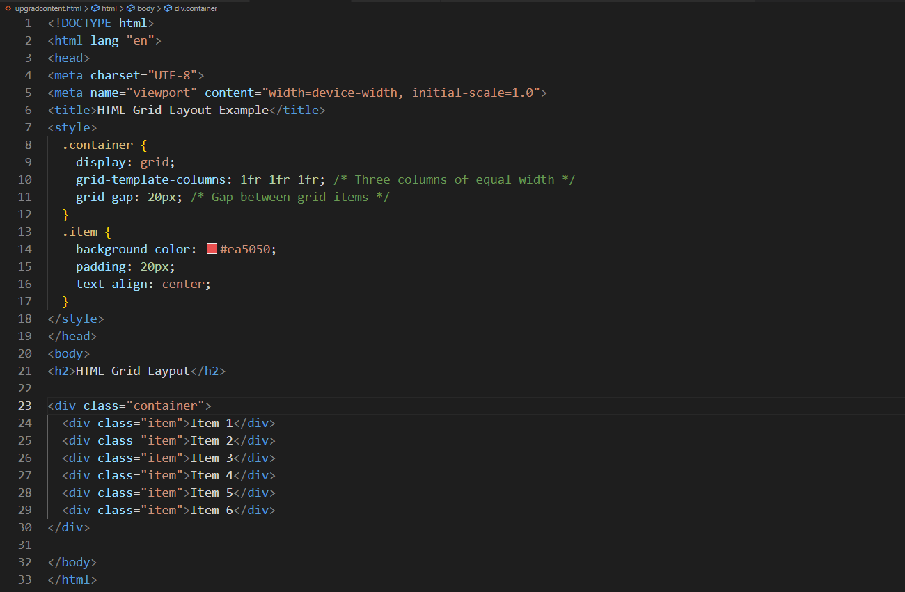
HTML Grid Layout
You may design intricate grid-based layouts with the two-dimensional CSS Grid layout technology. You can specify rows and columns and how components are arranged within Grid. This illustrates a grid layout in HTML:
<!DOCTYPE html>
<html lang="en">
<head>
<meta charset="UTF-8">
<meta name="viewport" content="width=device-width, initial-scale=1.0">
<title>HTML Grid Layout Example</title>
<style>
.container {
display: grid;
grid-template-columns: 1fr 1fr 1fr; /* Three columns of equal width */
grid-gap: 20px; /* Gap between grid items */
}
.item {
background-color: #ea5050;
padding: 20px;
text-align: center;
}
</style>
</head>
<body>
<h2>HTML Grid Layput</h2>
<div class="container">
<div class="item">Item 1</div>
<div class="item">Item 2</div>
<div class="item">Item 3</div>
<div class="item">Item 4</div>
<div class="item">Item 5</div>
<div class="item">Item 6</div>
</div>
</body>
</html>
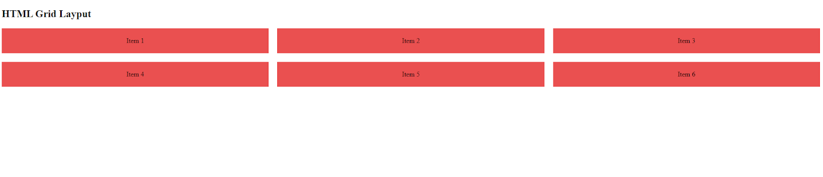
In this example, we make a straightforward grid consisting of two columns and uniform spacing between items.
Best Practices and Techniques for Layouting
Now you can try the following tips to improve your HTML layout skills. These best practices and techniques will help you create well organized websites.
Learn the Fundamentals of HTML Structure
Before diving into advanced layout techniques, ensure you have a solid grasp of basic page structure in HTML. Understanding how HTML documents are organized is crucial for creating effective layouts and building accessible websites.
Templates for HTML Page Layouts
Many developers utilize HTML page layout templates to speed up the layout design process. These templates offer a foundation for creating web pages with preset layouts and designs.
Choose Design That Is Responsive to Various Screen Sizes
One essential component of contemporary web development is responsive design. Because people visit websites on various devices, ensuring your HTML layout adjusts to multiple screen sizes is critical. With CSS media queries, you may apply various styles according to screen parameters like width.
User Experience and Navigation
A website's navigation is essential to its design. It assists users in navigating the website and locating the material they're looking for. Consider the following while creating successful navigation:
- Keep navigation on all pages consistent to prevent misunderstanding.
- Make sure that people with impairments can utilize the navigation. To increase accessibility, make use of ARIA features and semantic HTML.
- Create navigation that is both mobile and desktop-friendly using responsive design and adequate HTML code for page layout.
Use Style Guides and Design Systems.
Style manuals and design standards aid in preserving uniformity throughout your website. Establish a standard set of styles for components, colors, font, and spacing. This makes HTML layout selections easier to make and guarantees a unified design.
Make Use of Libraries and Layout Frameworks
Creating layouts may be accelerated considerably with the help of HTML layout frameworks like Tailwind CSS and Bootstrap. These frameworks provide responsive grids, pre-built elements, and a unified style.
Establish a Central Point
To direct visitors' attention, provide a distinct focus point in your HTML layout design. This may be a powerful image, a hero section, or a crucial call to action. A clearly defined focus point aids visitors in comprehending the primary purpose or message of your website.
Reduce Loading Times
Fast-loading layouts enhance search engine rankings and user experience. To make sure your HTML layout doesn't impair speed, optimize pictures, take advantage of slow loading, and reduce the number of external scripts.
With these best practices and techniques, you'll be well on your way to creating an HTML design layout that is visually appealing but also functional and accessible. Try incorporating them into your projects, and watch your layouts improve over time!
Here's a helpful tip for those gearing up for an interview: review the most commonly asked HTML interview questions and answers. It could give you the edge you need to impress your interviewer.
Wrapping Up
A website's HTML layout is its fundamental component. A well structured layout improves your website's look and cross platform compatibility. Use semantic HTML as much as possible to benefit SEO and accessibility. Your layouts may be responsive and versatile with the help of techniques like Flexbox and Grid. CSS is your friend for styling since it guarantees uniformity across your website. Remember to test your website across various browsers and devices to identify bugs. Now excel in HTML layout and create websites that users like visiting.
However, you can also visit upGrad for thorough explanations on various HTML subjects. It offers many quick lessons and courses for students and professionals who wish to improve and learn new abilities. Enjoy yourself while learning to code!
Frequently Asked Questions
1. What is the HTML layout?
An HTML layout refers to the structuring and organization of all content displayed on a webpage. This would include paragraphs, headers, footers, images and other associated media present on the page.
2. What are the basic building blocks of HTML layout?
The basic building blocks of HTML Layout include headings, paragraphs, containers, images, lists, forms and links.
3. What is the purpose of semantic HTML elements in layout?
It improves accessibility and search engine optimization by offering meaningful structure and context.
4. How can I create a responsive layout in HTML?
The key to creating a responsive layout in HTML is structuring. Using semantic HTML elements in layout ensures that you have a clear idea of what you are building which in turn would ensure that the end user finds it easier to navigate around the page.
5. What is the difference between <div> and semantic HTML elements for layout?
The <div> tag is a generic container with no inherent meaning, while semantic HTML elements indicate the content's purpose and improve accessibility.
6. How do I center content horizontally and vertically in an HTML layout?
You may use CSS Flexbox or CSS Grid to center content horizontally and vertically.
7. What is the box model in HTML layout?
The box model describes the text, padding, border, and margin of each element on a webpage.
8. How can I create a two-column layout in HTML?
You may build a two-column HTML page layout using Flexbox with display or CSS Grid with grid-template-columns.

Author


upGrad Learner Support
Talk to our experts. We are available 7 days a week, 9 AM to 12 AM (midnight)
Indian Nationals
1800 210 2020
Foreign Nationals
+918068792934
Disclaimer
1.The above statistics depend on various factors and individual results may vary. Past performance is no guarantee of future results.
2.The student assumes full responsibility for all expenses associated with visas, travel, & related costs. upGrad does not provide any a.