Introduction
As a web developer, understanding the box model in CSS is crucial for creating visually appealing and responsive layouts. The box model represents how elements are sized and spaced on a web page. This comprehensive tutorial will delve into the concept of box sizing in CSS, explore its different values, and learn how to create efficient layouts using this property.
Overview
The box model in CSS is the foundation of the layout, representing an element's content, padding, border, and margin. By default, when you define dimensions for an element, those only include the content area. However, with the box-sizing in CSS, you can modify this behavior and include the padding and border in the dimensions, making it easier to create predictable and responsive layouts.
What is CSS Box Sizing Property?
The `box-sizing` property is used to control the box model behavior of an element. It has two main values:
1. `content-box` (default):
The `content-box` value is the default behavior of the box-sizing in CSS. When an element has the `box-sizing: content-box;` property applied, its dimensions are calculated based on the content area, excluding any added padding or border.
In this model, an element's specified width and height represent only the content area's dimensions, and any padding or border is added to that. This means that the actual space occupied by the element on the web page will be larger than the specified width and height due to the inclusion of padding and border.
The `content-box` model can sometimes lead to unexpected layout behavior, especially when designing fixed-size elements, as it requires manual adjustments to account for the extra space taken by padding and border.
2. `border-box`:
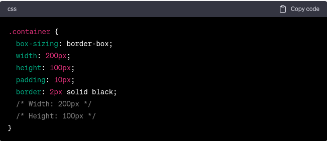
The `border-box` value of the `box-sizing` property offers a more intuitive and predictable way of sizing elements within the CSS box model. When an element has the `box-sizing: border-box;` property applied, its specified width and height include both the content area and any added padding and border.
In this model, the specified width and height represent the total dimensions of the element, encompassing the content, padding, and border. This makes layout calculations more straightforward, as the element's size remains consistent regardless of the padding and border values.
The `border-box` model is particularly beneficial when creating fixed-size elements or managing layouts with strict size requirements. It avoids unexpected sizing discrepancies and simplifies the process of designing and positioning elements on the web page.
Let's understand the difference with an example:
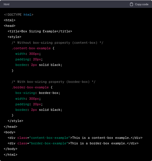
In the `content-box` example, the box's total width would be `300px + 40px (20px padding on each side) + 4px (2px border on each side)`, resulting in an element wider than you might expect. In contrast, the `border-box` example retains a total width of `300px`, as the padding and border are included within this width.
Box-Sizing: Content-Box (Explanation With Example)
The `content-box` value is the default behavior of elements in CSS. When using this value, dimensions are calculated based only on the content area, and padding and border are added to the specified width and height. For example:
Box-Sizing: Border-Box (Explanation With Example)
The `border-box` value includes padding and border in the specified width and height, making creating fixed-size elements with consistent dimensions easier. For example:

Comparing `content-box` and `border-box`
The primary distinction between the border-box and content-box in CSS lies in how they interpret the specified dimensions and handle the inclusion of padding and border.
- In the `content-box`, the specified dimensions represent only the content area, and any padding and border are added on top of those dimensions. This can lead to larger actual dimensions on the web page, requiring extra consideration when designing layouts.
- In contrast, `border-box` includes padding and border within the specified dimensions. This results in a more predictable and consistent element size, making it easier to create fixed-size elements and manage layouts with precision.
Selecting the appropriate `box-sizing` value depends on the specific layout requirements and design goals. While `content-box` is the default behavior, web developers often prefer `border-box` for its ease of use and consistency in sizing elements. Choosing the most suitable value based on the project's needs is essential to achieve efficient and visually appealing layouts.
Creating Layouts with Box Sizing in CSS
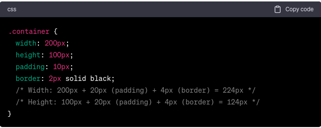
The `box-sizing` property becomes especially useful when creating responsive layouts. Let's consider a common scenario of building a two-column layout with equal-width columns and some spacing between them.
Here, both columns will have a width of `50%`, and the padding and border are included within that. This ensures that the columns remain equal-width and fit nicely within the container.
CSS Box-Sizing Reset
Sometimes, when using third-party CSS frameworks like Tailwind CSS, you might encounter issues with the `box-sizing` property.
Apart from Tailwind CSS, a `box-sizing` reset can be triggered by any of the following conditions:
1. CSS Reset/Normalize Stylesheets:
Developers often reset or normalize stylesheets to ensure browser compatibility. These stylesheets reset or normalize default browser styles, including the `box-sizing` property, to create a clean and consistent styling base.
2. Third-party CSS frameworks:
Bootstrap, Foundation, and Bulma may have default box-sizing values. They could accidentally reset the box-sizing property for all items in their scope.
3. Global Stylesheets/Theme Styles:
Global stylesheets or theme styles can apply consistent styling across a website in large projects or content management systems. These stylesheets may set a box-sizing value for the layout.
4. Specific Component Styles:
Some components or UI elements require a different box-sizing value to get the correct layout behavior. Component-specific stylesheets or inline styles could customize box-sizing for those items.
5. JavaScript/UA Stylesheet CSS Reset:
JavaScript or user agent stylesheets may occasionally apply a "box-sizing" reset to elements. This approach is rare since it can cause unexpected layout behavior and is not encouraged.
6. Inherited Styles:
If not explicitly set, child components inherit the `box-sizing` attribute from their parents.
To ensure consistency, resetting the `box-sizing` property for all elements is a good practice.
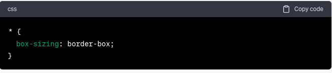
By adding this CSS rule at the beginning of your styles, all elements on your page will adopt the `border-box` model, simplifying layout calculations.
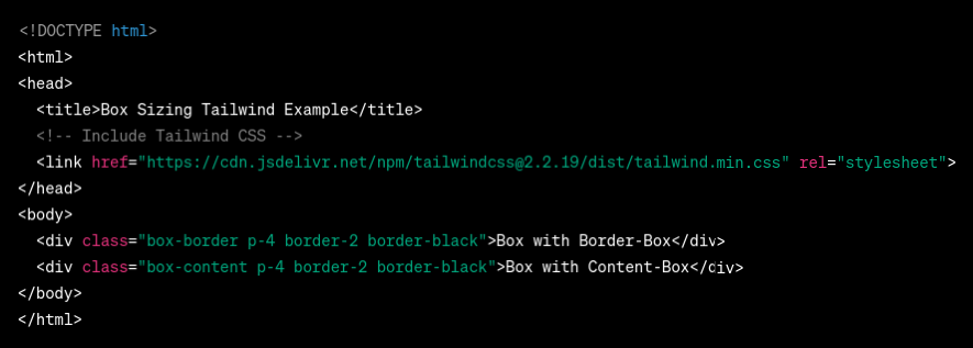
Box Sizing in Tailwind CSS
Tailwind CSS is a popular utility-first CSS framework that provides a set of pre-defined utility classes, including ones for modifying box-sizing. To use `box-sizing` in Tailwind CSS, you can apply the `box-border` or `box-content` utility classes, which correspond to `border-box` and `content-box`. For example:
Box-Sizing: Inherit
The property box-sizing: inherit; enables an element to inherit the box-sizing value from its parent element. The box-sizing property of the parent element is automatically inherited when applied to a child element, thereby ensuring consistency within the layout.
Some practical scenarios where the box-sizing: inherit; property can be utilized include:
- When dealing with nested components, it is often desirable for the child components to inherit the box-sizing behavior of their parent in order to ensure a consistent layout structure.
- To make global layout adjustments on your website, it is recommended to set the box-sizing property on a parent container and use the inherited value on child elements. This approach will ensure that all elements within the specified section adhere to the same sizing model.
For example:
Troubleshooting Box-Sizing Issues
If you encounter situations where box-sizing: border-box is not working as expected, consider the following common reasons:
1. Incorrect CSS Rule Order: Ensure that the `box-sizing: border-box` rule comes before any other rules that set the width or height of the element.
2. Padding and Border Conflicts: Be cautious when adding negative margins or additional padding and borders, as they might affect the element's total dimensions.
3. Incorrect Box-Sizing Reset: If you have a global `box-sizing` reset in your CSS, double-check that it's applied correctly to all elements.
The Box Model in CSS
The container model in CSS is a fundamental idea that governs how elements are rendered and located on an Internet web page. It defines the various layers that comprise an element, each contributing to its length and spacing. By gaining knowledge of the box model, developers can effectively control the format and presentation of elements, making sure of a visually attractive and consistent design.
The container version consists of four layers:
Content: The content material layer represents the actual content of an element, including textual content, photographs, or other nested elements. It is the deepest layer and defines the space required to accommodate the principal content of the element.
Padding: The padding layer surrounds the content material and offers extra space between the content material and the element's border. Padding makes it visually fascinating and improves the element's readability.
Border: The border is a line that surrounds the element's content and padding. It defines the outermost boundary of the element and acts as a visual separator between the element and its surrounding space. Borders may be styled with distinctive colorings, widths, and styles to create visible emphasis and enhance the element's appearance.
Margin: The margin is the space between the detail and its surrounding elements. It creates distance between adjacent elements, preventing them from visually overlapping. Margins help maintain a smooth and organized layout by controlling the spacing between elements.
Controlling Element Dimensions with box-sizing:
The box-sizing property in CSS plays an essential role in how the box model behaves and how the size of an element is calculated. It permits web developers to select how the distinct layers (content, padding, border) are protected in the detail's general dimensions.
Advantages and Disadvantages of CSS Box Sizing
Benefits:
- Predictable Layout: CSS box-sizing, notably border-box, lets developers create predictable and consistent layouts.
- Efficient Responsive Design: Box-sizing content-box lets elements adapt their sizes to their content or parent container.
- Intuitive Sizing: Border-box appropriately represents an element's padding and border.
- Simplified Calculations: Border-box simplifies layout calculations for developers.
- Consistency: Box sizing ensures device and browser uniformity.
- Reduced Overhead: Box-sizing reduces the requirement for special CSS rules to govern element dimensions.
Drawbacks:
- Browser Compatibility: Modern browsers support box-sizing, although IE 7 and earlier may not.
- Conflicting Styles: Complex projects with several CSS files or third-party libraries can accidentally create box-sizing conflicts.
- Learning Curve: Understanding the box model and box-sizing can be difficult for novices or developers switching layout models.
- Unintentional Overrides: A global box-sizing reset can affect third-party components or libraries that presume a different value.
- Potential Performance Impact: Using content-box and changing element widths based on content, excessive padding, or nested elements can slow rendering.
- CSS Specificity: Complex CSS hierarchies make handling box-sizing rules difficult in large applications.
Conclusion
Mastering the concept of box sizing in CSS is vital for web developers to create responsive and visually appealing layouts. Using the `border-box` model and following best practices can simplify layout calculations and ensure consistent element sizing. Incorporate `box-sizing` into your projects, and you'll be well-equipped to build user-friendly web pages easily.
FAQs
1. How does the box model influence block, inline, and inline-block elements?
Different display types function similarly in the box model. Regardless of display style, content, padding, border, and margin determine element size. The box-sizing attribute controls how the box model calculates dimensions for any element, whether block, inline, or inline-block.
2. How does box-sizing impact performance?
Box-sizing has a negligible performance impact. The voice between the content box or border box depends on layout and style. However, excessive padding or nested items might slow rendering, so optimize your layout and CSS for performance.
3. How can I integrate third-party components or libraries with different box models?
To understand third-party components and libraries' default box-sizing behavior, consult their documentation. You may need to change your layout or apply CSS rules to override the component's box model.


-d9bdeff6165f4eb1ba2adcebde78e961.svg)


-ae8d039bbd2a41318308f8d26b52ac8f.svg)
-35c169da468a4cc481c6a8505a74826d.webp&w=128&q=75)
-7f4b4f34e09d42bfa73b58f4a230cffa.webp&w=128&q=75)


